
So… another missing icon gets some attention 🙂
This time it was Kommit.
The funny thing about Git related icons is that everybody eventually ends up drawing the same thing. A couple of connected nodes, some branches in a diamond shape....
I started pretty close to the existing Git visual language adjusted to Oxygen, but after a few iterations the icon slowly started drifting towards something that felt a bit more interesting. Softer shapes, more emphasis on the flow of the branches and less "K pasted into a square". (we love k)
So here is the story of how a icon is set to life I could say a ton more things but.... heeee
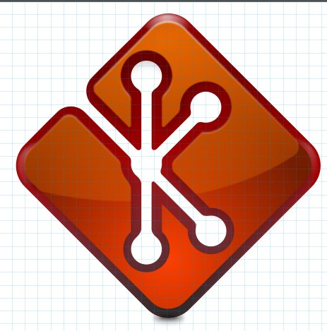
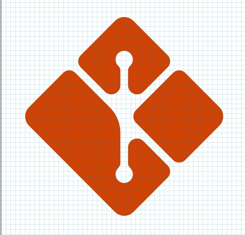
This was not working for me at all need to pivot....
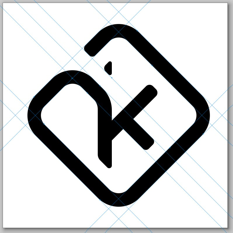
ok there is somthing cool here lets explore more
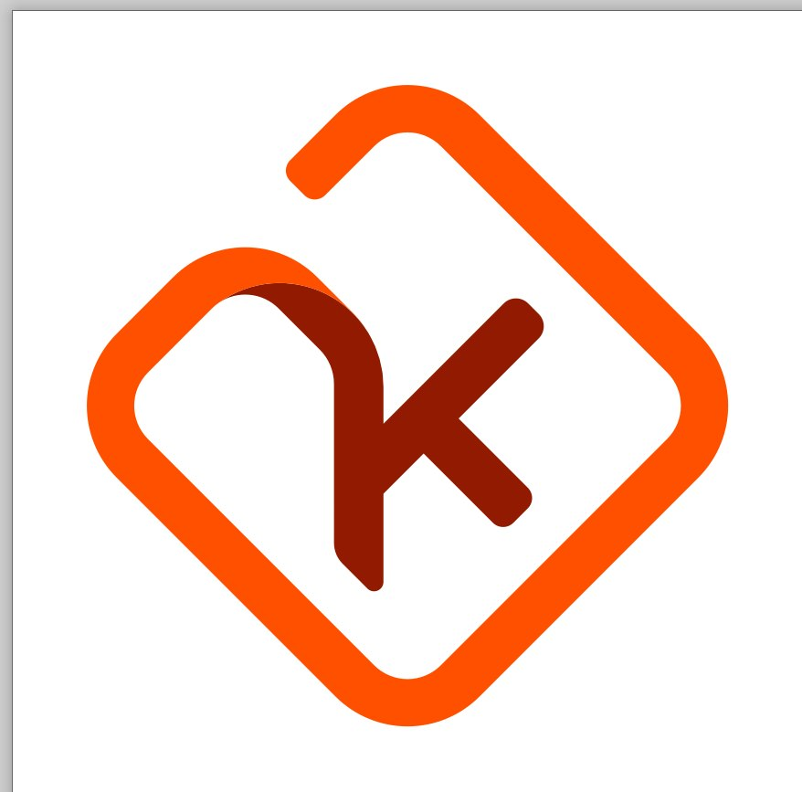
shading lets do shading, (the old trick) oo and what if the line was a kinda of a flowing path?
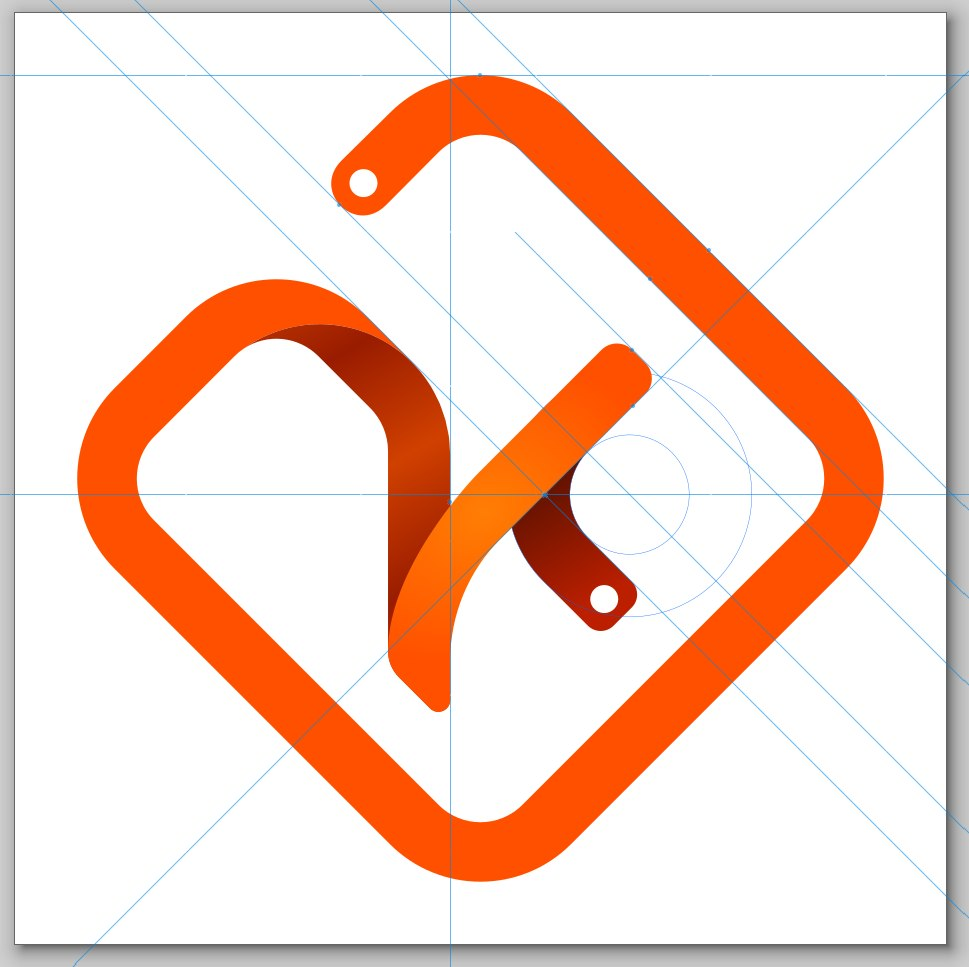
wil never work as an icon, hummm.. need to make it more boxy!
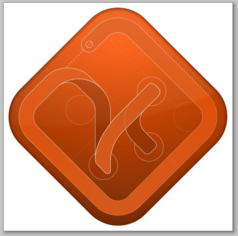
hummm maybe less red??? the previous line art was kinda cooler loking... ;(
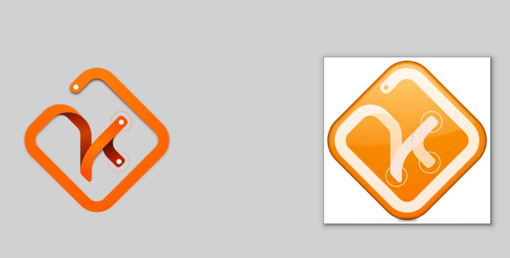
yeah!!!.... but what if we make the lines more chubby?

ooooo yeah...."that is the way"

0 Comments
Log in to join the conversation.No comments yet. Be the first to share your thoughts.