
I don't know much about dithering. But when I visit other people's sites and they dither their images in cool ways I always wonder how they do it. So in case anyone is wondering, here's my current method for dithering these pink images.
Obligatory example image for when I undo this 2 months from now and no one knows wtf I am talking about:
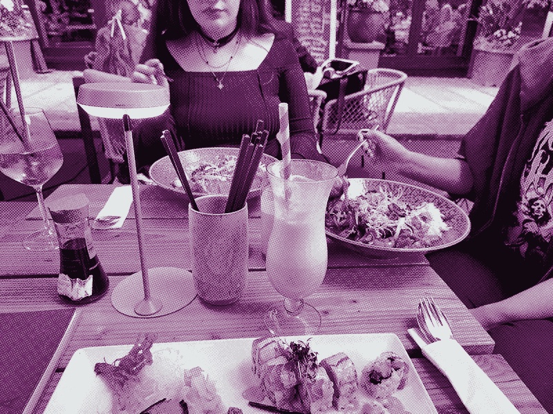
Edit: Almost like I know myself to well — the pictures now look like this instead:
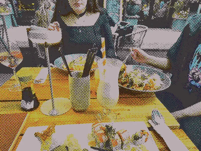
Which is covered in the post.
Dithering, beside making a picture look (to put it professionally) cool as fuck, also reduces file size and thus needed storage (if using only the reduced images) and the weight of your website for the client. That's why sites like Low Tech Magazine use it, for example.
The idea of pink images came from a post a while back, when I tried this before. The post Designing without color introduces the idea of the current design, where I try to get a sort of black and white "printed" vibe, using color only for emphasis. (This makes sense only when you are a light mode user like me).
The image back then, with the old method, looked like this:
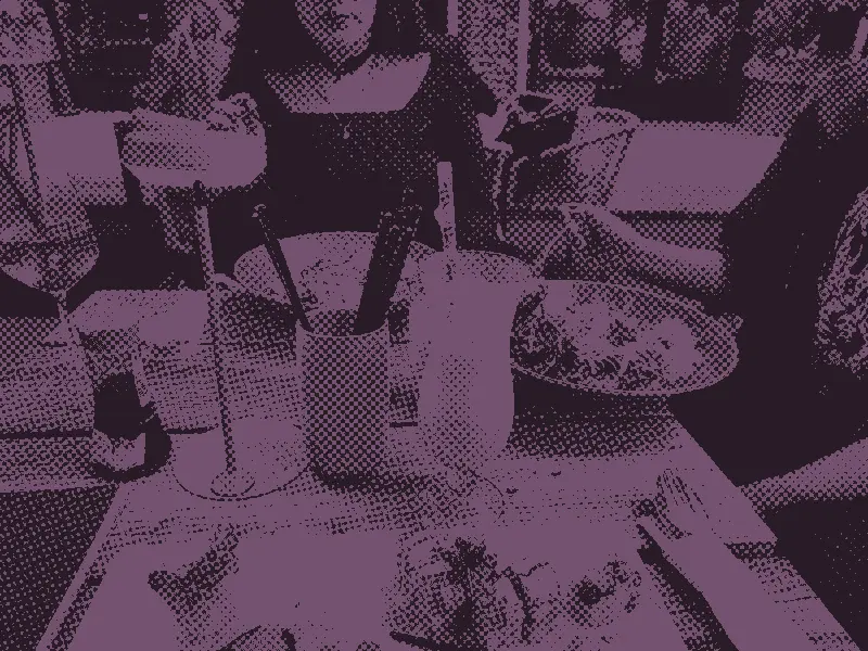
The key difference here being that I limited the picture's palette to true monochrome: black and this pink. Also, the weird "dithered" dots are much bigger.
So what's this
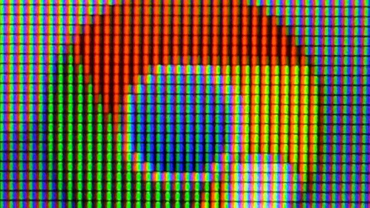 My goal was to immitate a printed image. While individual pixels on a screen may have the luxury of setting variable values of red, green and blue — making the grid of repeating RGB lights on your screen light up with different intensity — things work a little differently on paper (and other print substrates).
Getting the limited palette of colors your printer is working with to give the illusion of more colors requires using a grid/matrix of dots. You can go about this in three different ways: AM, FM and hybrid grids. The amplitude here being the size of the dot and the frequency, well … the frequency. Making a dark spot with AM grids means big dots, in FM grids it's lotsa dots.
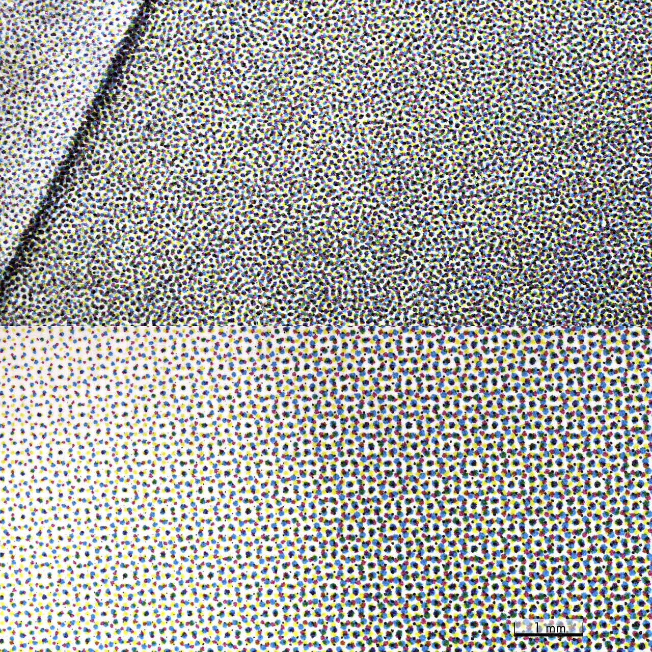
The top shows an FM print: the dots look chaotic.
The bottom shows AM: all dots show up in a predictable pattern and light spots have smaller dots
The problem with amplitude modulated dots is that if you approach this naively you will end up getting unwanted patterns in your images: a so-called Moiré.
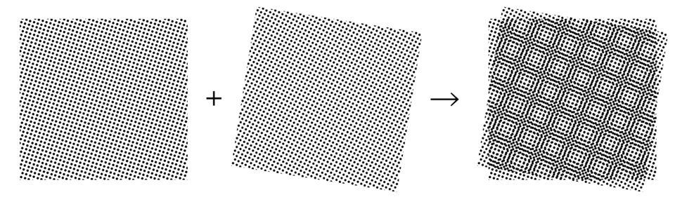
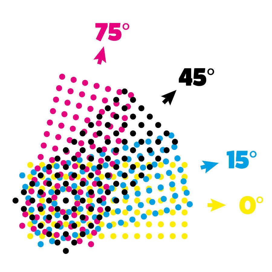
For this reason, there is a rule (DIN 16547) about how exactly the colors are to be offset in an AM print to try and avoid them getting in each others way. Since FM grids are random they do not suffer from this problem.
Simulating AM pattern on your digital image
I access my server via the command line — so I use a command line tool to quickly edit images. The tool is called imagemagick and is called using the "convert" command.
I found the method to create this illusion online (can't find the link) and adapted it a little. So I can't claim to be the expert on what each individual argument does, but I will try to explain it.
convert "oldfile" -resize 800 -set option:distort:viewport '%wx%h+0+0' \
                 -colorspace CMYK -separate null: \
                 \( -size 2x2 xc: \( +clone -negate \) \
                +append \( +clone -negate \) -append \)  \
                -virtual-pixel tile -filter gaussian  \
                \( +clone -distort SRT 2,0 \) +swap  \
                \( +clone -distort SRT 2,15 \) +swap   \
                 \( +clone -distort SRT 2,45 \) +swap  \
                \( +clone -distort SRT 2,75  \) +swap +delete \
                -compose Overlay -layers composite -set colorspace CMYK -combine \
                "newfile"
Here's what it does generally: resizes the image to 800px in width (who needs more?), sets the color to CMYK, applies a background to fill the empty space left by rotating (and sets a gaussian blur to filter noise), splits up into the colors, scales them up a bit (for bigger dots) and distorts them (in this case: rotates them) and at the end it combines the 4 images into one again.
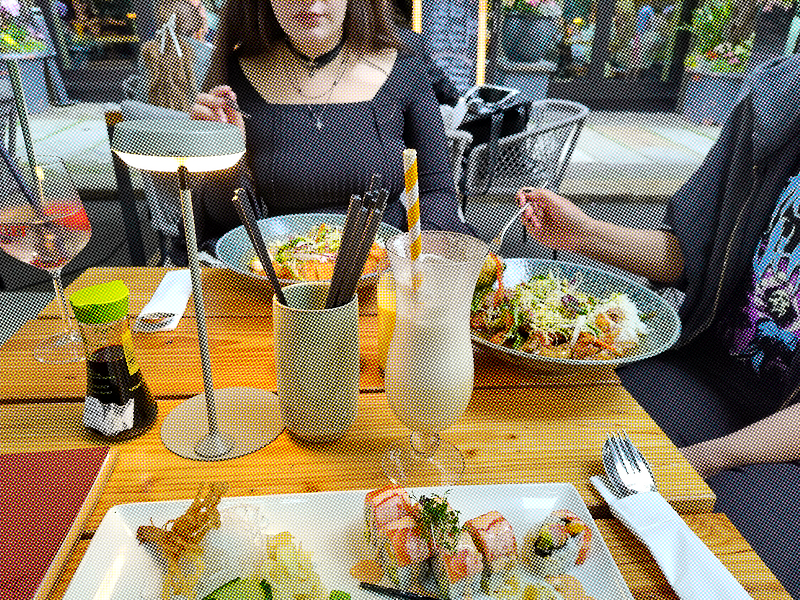
The image we generate by running this on the original file looks like this:
Before combining them, these are the individual colors dot grids:
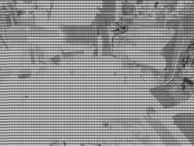
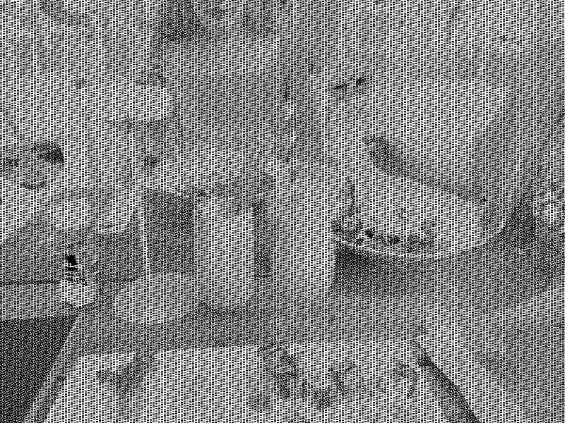
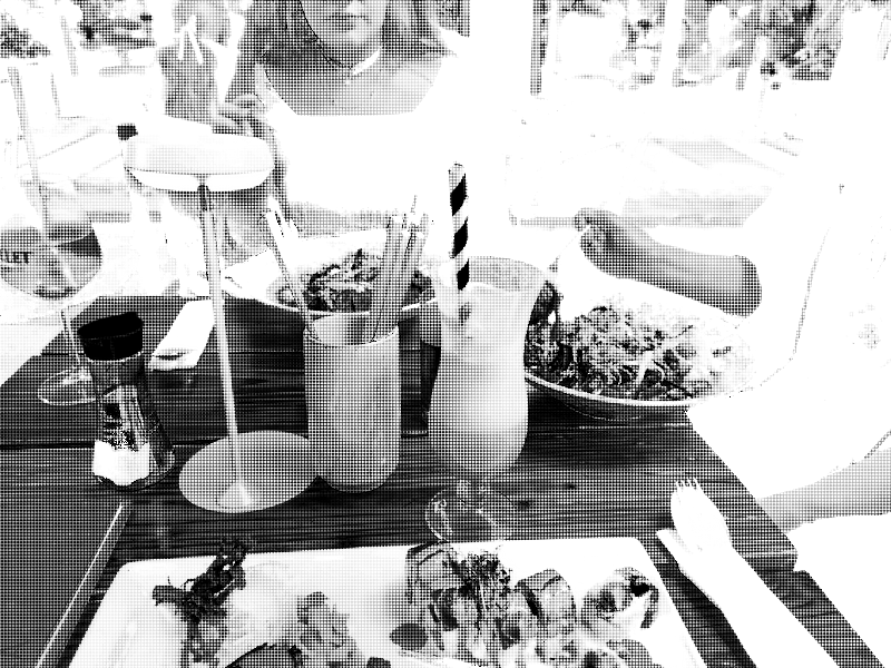
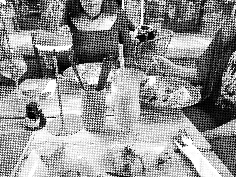
This sets C at 0°, M at 15° etc. But whatever. Zooming in and out doesn't make any weird artifacts apparent so it's good enough.
If we increase the size of the dots to a ridiculous degree (8x8), you can get a better look at what is happening.
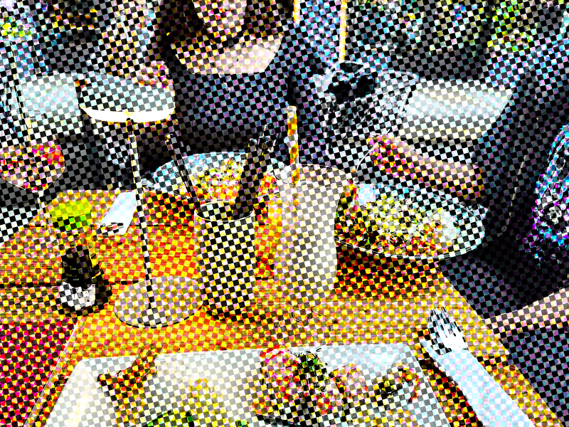
Edit: The perfect route to CMYK
After sleeping on it and reading the post back, the solution for a pic limited to truly CMYK colors in an AM grid is apparent. For reasons I get into later this is NOT a good way of reducing file size (apart from the fact that limiting colors and resizing the image to 800 in width always reduces the size, everything else is pretty much stacked against that goal). It does, however, look cool.
With the above method, the dots do not vary in size. Why should they? As we already discussed, a digital image (unless I have a GIF or PNG-8 situation somewhere) can give varying intensity of light for R, G and B per pixel. So when we look at the big image above we can cleary see some of the squares are just darker than others. For a true immitation this will not do!
All we need to do is to limit each channel's colors to 2 before combining them again. This is very obvious in hindsight. Idk why the person I got the original command from didn't do this.
convert "oldfile" -resize 800 -set option:distort:viewport '%wx%h+0+0' \
                 -colorspace CMYK -separate null: \
                 \( -size 2x2 xc: \( +clone -negate \) \
                +append \( +clone -negate \) -append \)  \
                -virtual-pixel tile -filter gaussian  \
                \( +clone -distort SRT 2,0 \) +swap  \
                \( +clone -distort SRT 2,15 \) +swap   \
                 \( +clone -distort SRT 2,45 \) +swap  \
                \( +clone -distort SRT 2,75  \) +swap +delete \
                -compose Overlay -layers composite -colors 2 -set colorspace CMYK -combine \
                "newfile"
This will produce an image that looks like this:
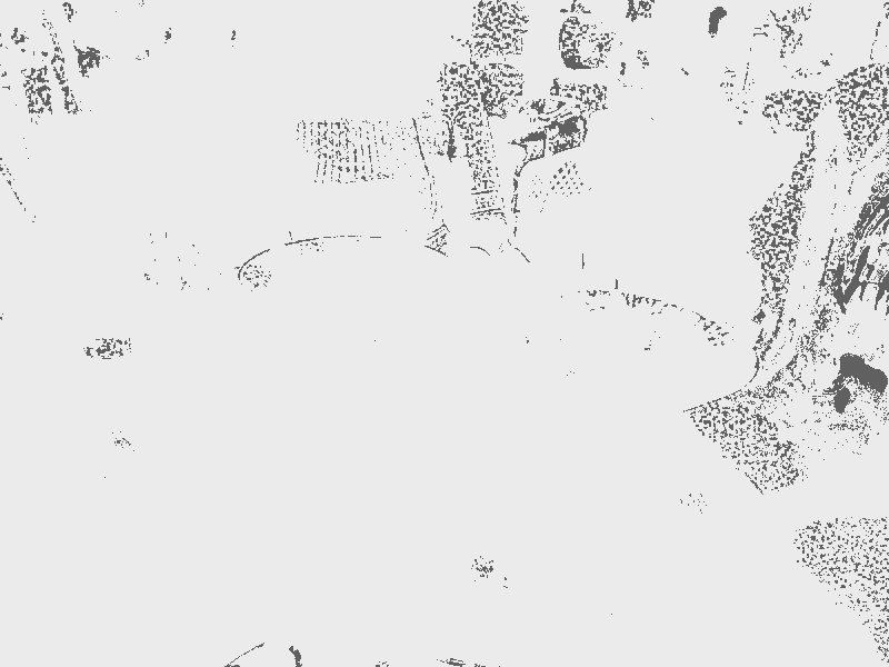
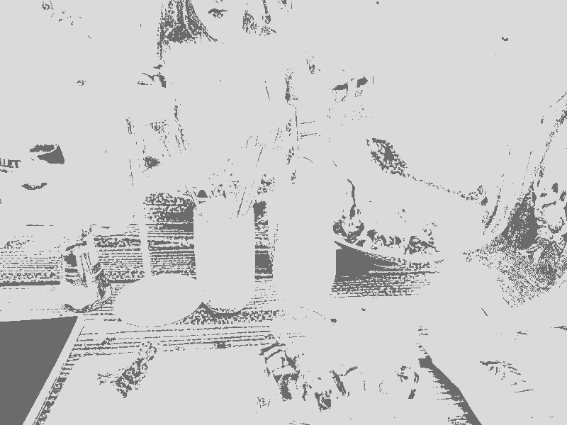
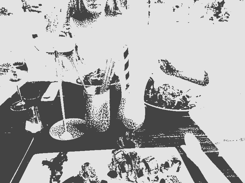
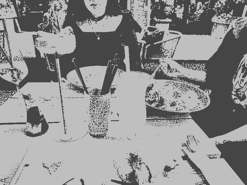
In retrospect I wonder if I might try out images like this instead of pink. If all I want is the general vibe of the grid then pink is fine. Though it does have more colors (shades of pink) for less colors (actually useful distinct ones). Who said blogging about your stupid idea isn't useful?
Pink — old method
The script for the old way of doing it had the values of -distort SRT set to "2 (rotation)", meaning it scaled the colors up to 2, making bigger dots.
After running the script above, the colorspace was once again converted, to Gray this time, after which the colors were leveled to monochrome: black and this pink. The whole command for those who want to try:
convert "oldfile" -resize 800 -set option:distort:viewport '%wx%h+0+0' \
                 -colorspace CMYK -separate null: \
                 \( -size 2x2 xc: \( +clone -negate \) \
                +append \( +clone -negate \) -append \)  \
                -virtual-pixel tile -filter gaussian  \
                \( +clone -distort SRT 2,0 \) +swap  \
                \( +clone -distort SRT 2,15 \) +swap   \
                 \( +clone -distort SRT 2,45 \) +swap  \
                \( +clone -distort SRT 2,75  \) +swap +delete \
                -compose Overlay -layers composite -set colorspace CMYK -combine \
                -colorspace Gray -colors 2   +level-colors  black,#A2719B \
        "newfile"
If we zoom in on the image before and after leveling the colors, we can see the dots do seem more like they vary in size. I omitted the -resize flag to give you a better view of the details.
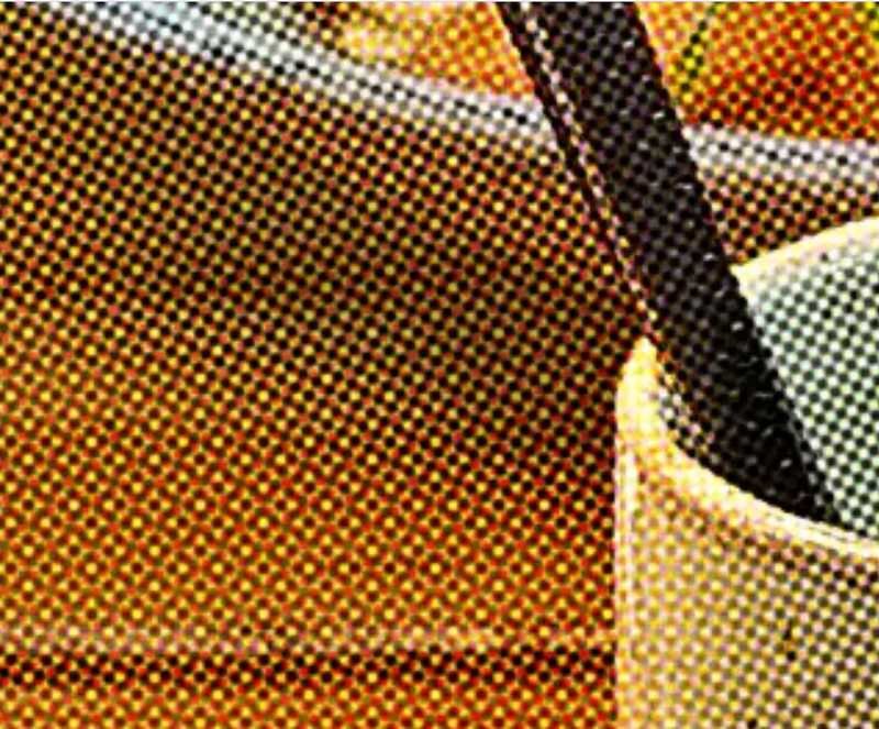

While not entirely accurate, I think this method gets the most printy feel out of an image. Sadly it can swallow a lot of detail, even if the dots aren't scaled up. So I abandoned this after a while (also I got sick of looking at it).
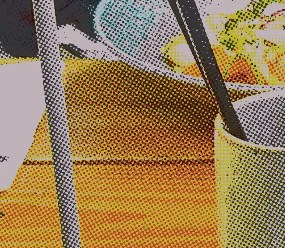
Edit: now compare to the real deal:
Pink – new method
Monochrome is a cool idea but just has limited use for the blog (and other pics on the website). I need some more depth. What I need is more values of pink. I get these by utilizing the -remap flag.

convert "oldfile" -resize 800 -set option:distort:viewport '%wx%h+0+0' \
                 -colorspace CMYK -separate null: \
                 \( -size 2x2 xc: \( +clone -negate \) \
                +append \( +clone -negate \) -append \)  \
                -virtual-pixel tile -filter gaussian  \
                \( +clone -distort SRT 1,0 \) +swap  \
                \( +clone -distort SRT 1,15 \) +swap   \
                 \( +clone -distort SRT 1,45 \) +swap  \
                \( +clone -distort SRT 1,75 \) +swap +delete \
                -compose Overlay -layers composite -set colorspace CMYK -combine \
                -remap "$palette" -colors 32 "newfile"
Problematic images
For images like the one I've been using everything works beautifully. But with images that are very overwhelmingly light, there can be issues.
Here's an example:
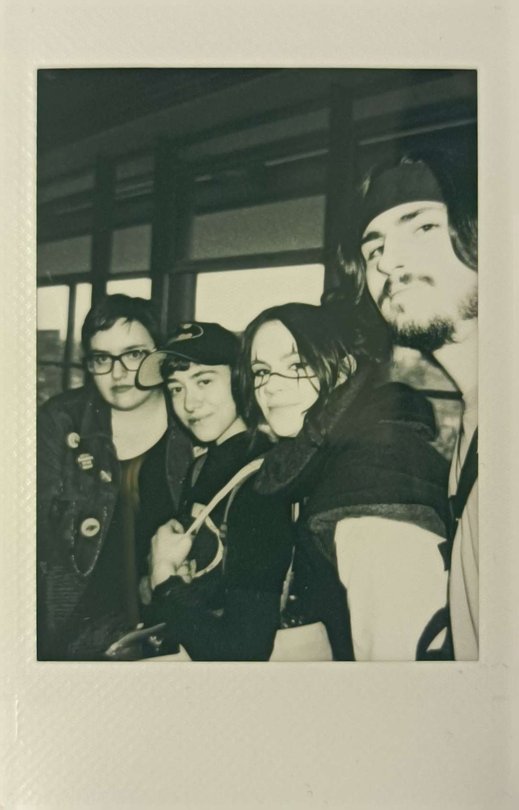 Original image
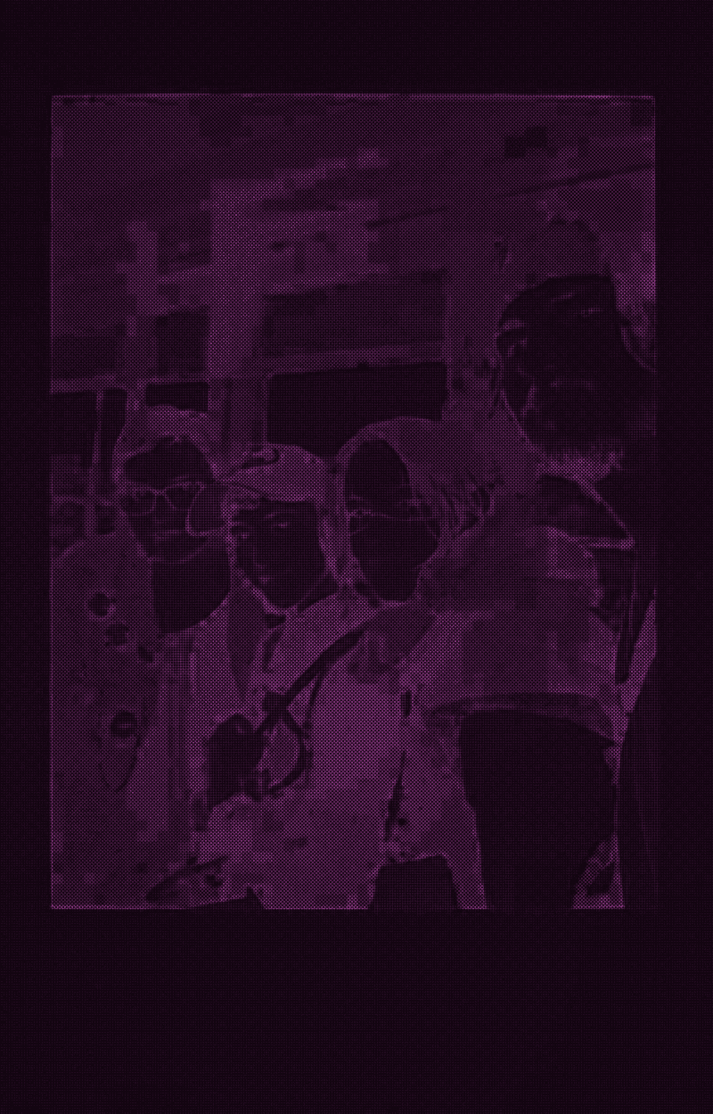 After running script
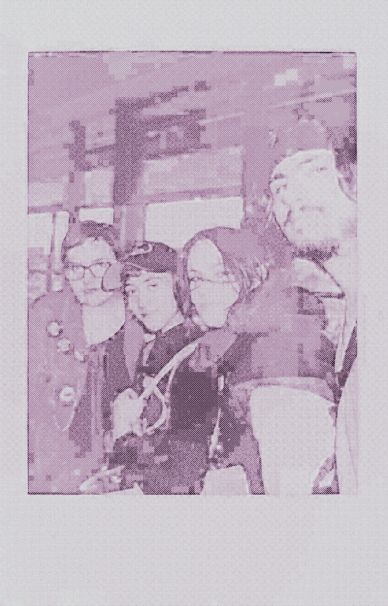 After manual edit
The edit in question: increasing brightness to 300%, Saturation to 200%, inverting colors and remaping them to pink
convert "oldfile" -modulate 300,200,100 -negate -remap $palette "newfile" This is possibly because my color palette is kinda bad.
Is this even dithering?
If all you care about is the result then you could say the image has been dithered, especially in the old method. Using only two colors we created the illusion of semitones (is this appropriate usage in English?)*. The same is basically true for the new method as well.
But if you care about the method this is not dithering. Or at least it's the most unnecessarily computationally expensive form of dithering I've come across. Let's walk through the steps one more time:
- Convert RBG to CYMK, adding one channel
- Split the image into four images and transform each one (starting with scaling them up and inverting them)
- limit colors to 2 on each and then overlay four images on top of eachother
- set colorspace to CMYK again
- limit the colors to 32/64/not sure yet where I want this (overlaying the 4 grids will create new colors)
This whole thing, on my laptop with an 11 year old CPU, can take 10 seconds if the image is big. The file size is not exactly "small" (though still smaller than unscaled pics with more than 32 colors). I can imagine the pattern isn't doing compression algorithms a huge favour. If you value your time or care about actually reducing an image's size do not do this.
Script
#!/bin/bash
temp="/tmp/images"
palette="/path/to/palette.png"
rm $temp
if [[ $1 = "" ]]; then
if [ -d smol ]; then
echo must run with argument
else
mkdir smol big
ls -r *.webp > $temp
ls -r *.png >> $temp
ls -r *.jpg >> $temp
ls -r *.jpeg >> $temp
ls -r *.gif >> $temp
fi
else
ls -r *$1 > $temp
cp *$1 big
cat $temp
cp $(cat $temp) big/.
fi
i=$(cat "$temp" | wc -l)
echo $i
    while [[ $i -gt 0 ]]
    do
name="$(head -n $i $temp | tail -n +$i)"
echo "doing $name"
convert "$name" -set option:distort:viewport '%wx%h+0+0' \
         -colorspace CMYK -separate null: \
         \( -size 2x2 xc: \( +clone -negate \) \
        +append \( +clone -negate \) -append \)  \
        -virtual-pixel tile -filter gaussian  \
        \( +clone -distort SRT 2,0 \) +swap  \
        \( +clone -distort SRT 2,15 \) +swap   \
         \( +clone -distort SRT 2,45 \) +swap  \
        \( +clone -distort SRT 2,75 \) +swap +delete \
        -compose Overlay -layers composite -colors 2 \
        -set colorspace CMYK -combine \
        -colors 64 "smol/$name"
(( i-- ))

echo $i
done
To end with, here is the original image with actual dithering (FloydSteinberg)
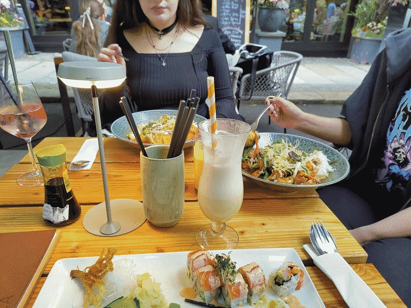
This file is smaller than the new (pink) method (but bigger than the old one).
Edit: the true method will produce a smaller file for this image :^} (though this is not a rule!)
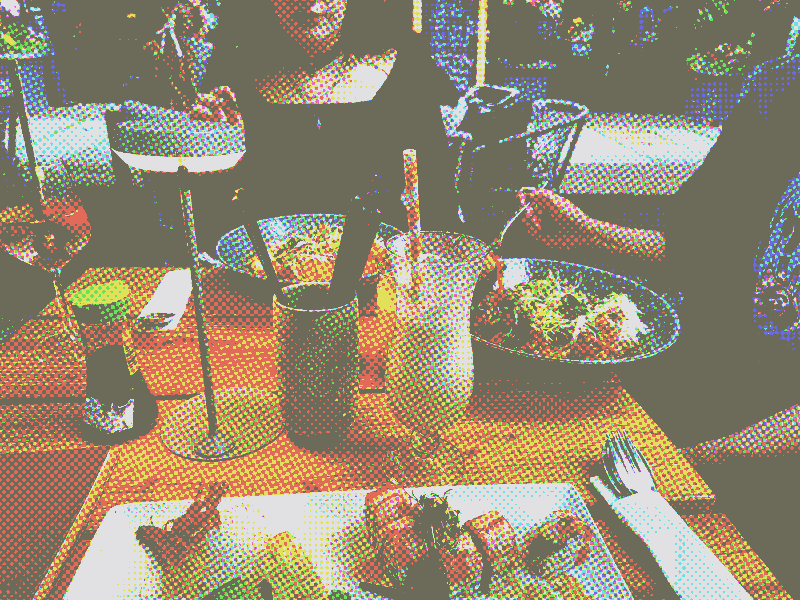
(Edit:) RGB
You can ofc do the same thing with RGB instead of CMYK. That wouldn't really be as accurate!! but here's the RGB AM grid version:
📍 Posted from Erfurt, DE

0 Comments
Log in to join the conversation.No comments yet. Be the first to share your thoughts.