
[This article was first published on Rstats – quantixed, and kindly contributed to R-bloggers]. (You can report issue about the content on this page here)
Want to share your content on R-bloggers? click here if you have a blog, or here if you don't.
Remember the “AI rat penis” incident at Frontiers in Cell & Developmental Biology?
In Feb 2024, Frontiers in Cell & Developmental Biology published a review paper with two comically bad AI-generated figures. In the first, a rat had a rather large organ. In the second, there was a nonsensical signalling pathway. Both figures had garbled labels. I won’t reproduce them here, but the paper (since retracted) is here. An example news piece covering the furore at The Vice is here.
Well, that was two and a half years ago. That’s enough water under the bridge to now check in and see how this incident affected the journal. If we look at how many papers published, we should be able to see whether the incident affected submissions.
I will say upfront that this analysis did not reveal what I thought it would. It’s well known that Frontiers journals had huge growth some years ago and I also knew that submissions had decreased in the last few years. So, I expected that this drop off was due to authors not wanting to publish in the journal after the AI figure debacle or perhaps a combination of that and the study by Mark Hanson and colleagues showing suspiciously fast turnaround times at journals, including titles from this publisher.
The plots can be quickly generated using {PubMedLagR} which is available here.
Jump to the code, or just look at the plots.
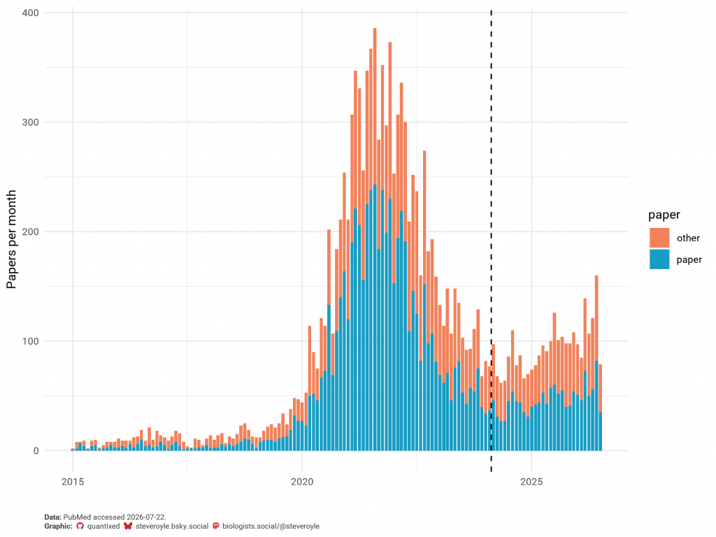
If we pull all the articles in PubMed for this journal and see how many were published per month, we get a plot like this. The dotted line shows the date of the rat penis incident.
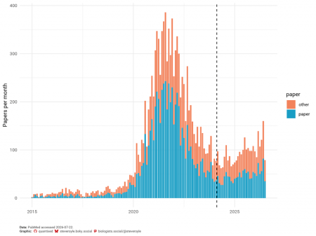
So there was a huge boom in publications in the COVID-19 pandemic era and then a decrease. This decrease predates the rat penis incident. If anything, the number of papers published began to stabilise and perhaps even recover following the incident!
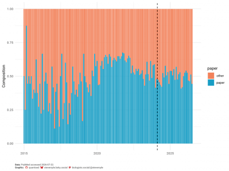
It’s a bit hard to see if the composition of articles has changed over time from the plot above. So let’s replot these data and look at the fraction of all articles that are papers versus other types. I did some spot-checking and there were several papers that are clearly Commentary, Editorial and Review types that are not properly tagged on PubMed. So take this with a pinch of salt. The articles are split 50:50 between papers and other types and this has not really changed. It could be argued that commissioned content might be unaffected whereas as directly submitted papers might drop off if authors were concerned about a journal. But there’s no evidence of that here.
This is looking at published papers. Obviously this metric lags behind the author behaviour we’re interested in. Did the rat penis incident affect submissions to the journal? We can look at the received dates of published papers:
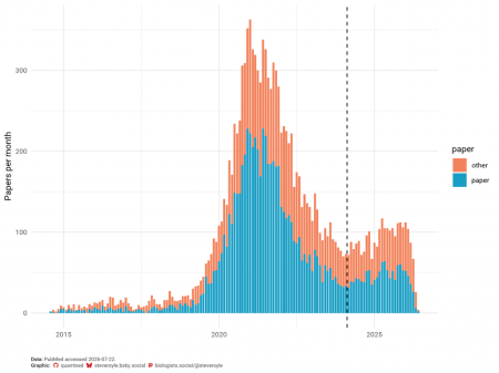
Pretty much the same story: month-on-moth submission are steadily rising after the incident.
Obviously we only have submission data for papers that were eventually published in the journal. We don’t know what the rejection rate was over this period. It would be possible for a beleaguered journal to reduce the rejection rate to stabilise the numbers of papers it publishes. But if we assume the rejection rate is constant, then submissions follow similar dynamics.
Conclusion: the AI debacle didn’t negatively affect submissions at this journal.
Maybe potential authors were unaware of this issue (although there was plenty of publicity), or maybe they view the incident as a one-off, or perhaps they’re not concerned about science integrity issues.
It’s no secret that the biggest drivers of journal choice for authors are 1) the journal impact factor and 2) the turnaround time/hassle to publish the work. The journals with the highest impact factor and the fastest turnaround win big. A scandal like this doesn’t seem to have affected journal choice. Of course, this is just a simple analysis and there are many factors at play here.
Isn’t it ironic though that authors want to publish in a journals with high impact factors? They want their paper to be viewed as potentially highly citable because of where it is published; but if that means that their paper appeared in a journal that has a scientific integrity issue, the cry is “judge the paper on its own merits, not where it’s published”…
The code
library(PubMedLagR)
library(ggplot2)

retrieve_journal_year_records("Front Cell Dev Biol", 2015:2026, batch_size = 200, papers_only = FALSE)
all <- pubmed_xmls_to_df(clean = FALSE)
# remove duplicate rows
all <- all[!duplicated(all),]
# clear Data/ and then
retrieve_journal_year_records("Front Cell Dev Biol", 2015:2026, batch_size = 200)
pprs <- pubmed_xmls_to_df()
# classify the papers in all
all$paper <- ifelse(all$pmid %in% unique(pprs$pmid),"paper", "other")
# convert publication date to the first of the month
all$year_month <- as.Date(paste0(substr(all$pubdate,1,7),"-01"))

# frontiers colours for fun
x <- c("242 130 91", "24 157 196")
fcolours <- sapply(strsplit(x, " "), function(x)
  rgb(x[1], x[2], x[3], maxColorValue=255))

# ggplot of number of papers per month-year
p1 <- ggplot(all, aes(x = year_month, fill = paper)) +
  geom_bar() +
  scale_fill_manual(values = fcolours) +
  geom_vline(xintercept = as.POSIXct(as.Date("2024-02-14")), linetype=2) +
  labs(x = "", y = "Papers per month") +
  theme_classic()
p1

# stacked plot version
p2 <- ggplot(all, aes(x = year_month, fill = paper)) +
  geom_bar(position = "fill") +
  scale_fill_manual(values = fcolours) +
  geom_vline(xintercept = as.POSIXct(as.Date("2024-02-14")), linetype=2) +
  labs(x = "", y = "Composition") +
  theme_classic()
p2

# what about submissions?
all$sub_year_month <- as.Date(paste0(substr(all$recdate,1,7),"-01"))
p3 <- ggplot(all, aes(x = sub_year_month, fill = paper)) +
  geom_bar() +
  scale_fill_manual(values = fcolours) +
  geom_vline(xintercept = as.POSIXct(as.Date("2024-02-14")), linetype=2) +
  labs(x = "", y = "Papers per month") +
  theme_classic()
p3
I added some styling to the plots to post them here, but the code will give the same three plots as in the post.
—
The post title comes from “New Frontier” by Donald Fagen from his 1982 “The Nightfly” LP.
0 Comments
Log in to join the conversation.No comments yet. Be the first to share your thoughts.