
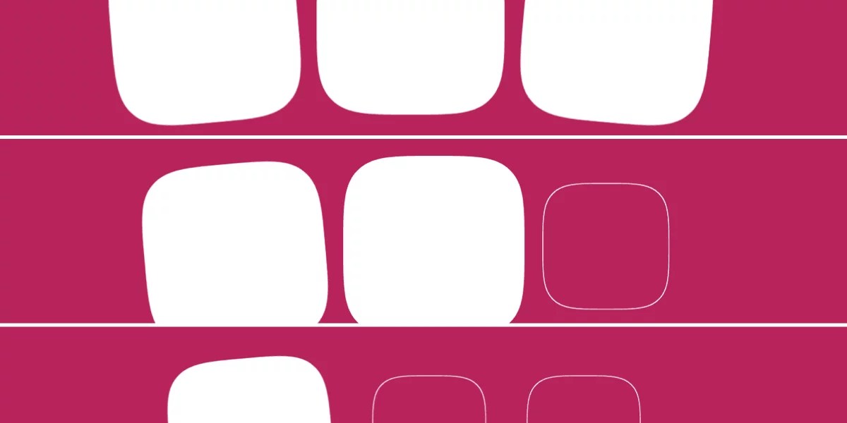
Chrome は scroll-triggered animations をリリースしました。これはこれを実装した初のブラウザです。Chrome 146 に更新すると、以下のデモを見ることができます。そこでは正方形の背景が 300ms の間フェードインしますが、これは要素全体がビューポート内に入ったときにのみ発生します。
これは scroll-driven animations の仕組みとは少し異なります。この記事ではそれらを比較し、その後 scroll-triggered animations の仕組みを紹介します。
Scroll-triggered animations は、特定のスクロールしきい値を超えたときに固定の継続時間で再生されます。(JavaScript の Intersection Observer API を CSS アニメーション用に考えたものだと思ってください。)
これは scroll-driven animations とは異なります。scroll-driven animations では、アニメーションの進行がスクロールの進行(animation-timeline: scroll())や交差の度合い(animation-timeline: view())と同期されており、したがって duration を持ちません。
重要な部分は animation-timeline: view() の代わりに timeline-trigger: view() を使用することです。これは、要素がしきい値内に入るのを待機し、どの程度入っているかを測定してそれに応じて処理するわけではありません。ただし、まず実際の @keyframes アニメーションから始めましょう。これは background を設定します:
/* Define the animation */
@keyframes fade-bg-in {
  to {
    background: currentColor;
  }
}
これは .square に 300ms の継続時間で設定されます:
.square {
  /* Declare animation */
  animation: fade-bg-in 300ms;
}
デフォルトでは CSS アニメーションは宣言が適用されたときにトリガーされますが、以下の拡張スニペットでは timeline-trigger がその動作を上書きします。これで、アニメーションは要素が view() に入ったときにトリガーされます。--trigger は単にトリガーの識別子として機能する dashed ident であり、一方 entry 100% exit 0% はタイムライン範囲です。タイムライン範囲は、アニメーションがアクティブ化され、アクティブな状態を維持できるスクロールゾーンを指定します。
この場合、アニメーションは .square の下端が(entry 100%)に入ったときにトリガーされ、上端がスクロールポートから出たとき(exit 0%)に(まだ実行中の場合)非トリガーになります。明確にするため、entry 0% は要素の上端が入ったときにアニメーションをトリガーします。entry は要素がスクロールポートの下から入ってくるのを扱い、exit は上から出ていくのを扱います。少し混乱しますが、過度に説明しなければ理解しやすくなります。
.square {
  /* Declare animation */
  animation: fade-bg-in 300ms;

  /* Animation trigger conditions */
  timeline-trigger: --trigger view() entry 100% exit 0%;
}
animation-trigger では、まずどのトリガーについて話しているかを指定し、その後いくつかの設定を宣言します(例: play-forwards):
.square {
  /* Declare animation */
  animation: fade-bg-in 300ms;

  /* Animation trigger conditions */
  timeline-trigger: --trigger view() entry 100% exit 0%;

  /* Animation trigger settings */
  animation-trigger: --trigger play-forwards;
}
play-forwards キーワードは、正方形が完全に表示されたときにアニメーションをトリガーします。また、アニメーションの fill mode を(animation-fill-mode を使用するか animation ショートハンドの一部として)宣言していないため、アニメーション終了後に正方形が背景を保持しないことを意味します。つまり、このアニメーションは一種のフラッシュになります。
したがって、異なる結果を得るためにこれを拡張する必要があります。
animation-fill-mode vs. <animation-action>
まず、animation-fill-mode または animation ショートハンドの一部として使用できる異なる fill mode 値が何をするかの概要です:
forwards: スタイルはアニメーション後に保持されます。backwards: スタイルはアニメーション前に適用されます。both: 両方の動作が適用されます。
ここで、<animation-action> が play-forwards(前述のように)で、fill mode が forwards(both は background が最初に設定されていないため冗長)であると仮定しましょう:
.square {
  animation: fade-bg-in 300ms forwards;
  timeline-trigger: --trigger view() entry 100% exit 0%;
  animation-trigger: --trigger play-forwards;
}
これによりスタイルは保持されますが、正方形が部分的にまたは完全にビューポートから出て再び入ると、アニメーションが再起動し、アニメーションの終了方法によってはフラッシュが発生する可能性があります。この例ではそれが起こっています。
これを解決する方法は 2 つあります…
「ロックイン」方式:play-forwards の代わりに play-once を使用します。これを forwards と組み合わせると、アニメーションは 1 回だけ再生され、二度と再起動せず、その後スタイルを保持します。
.square {
  /* Play once */
  animation-trigger: --trigger play-once;

  /* Retain the styles */
  animation: fade-bg-in 300ms forwards;

  timeline-trigger: --trigger view() entry 100% exit 0%;
}「往復」方式:play-forwards play-backwards は、正方形が完全に表示されたときに通常にアニメーションし、完全に表示されなくなったときに逆方向にアニメーションします。フラッシュが発生しないのは、要素が前方にアニメーションするのと同じくらいスムーズに後方にアニメーションするためです。また、アニメーションの方向が変わる可能性があるにもかかわらず、fill mode は both ではなく forwards のままにできます。
なぜ?
play-forwards は「アニメーションを 0% から 100% まで再生する」を意味し、play-backwards は「アニメーションを 100% から 0% まで再生する」を意味します。一方、先に述べたように forwards fill mode は「アニメーション完了時にスタイルを保持する」を意味します。これは、最終キーフレームが 0% か 100% かに関係なく適用されます。
.square {
  /* Play forward and backward, as appropriate */
  animation-trigger: --trigger play-forwards play-backwards;

  /* Retain the styles either way */
  animation: fade-bg-in 300ms forwards;

  timeline-trigger: --trigger view() entry 100% exit 0%;
}play-forwards、play-once、play-backwards は <animation-action> に使用できる唯一のキーワードではありません。以下に簡単な概要を示します:
<animation-action> | Effect |
|---|---|
none | For disabling triggers conditionally, on entry but not exit (or vice-versa), or handling multiple triggers with one animation-trigger |
play-forwards | Allows the animation to play forward |
play-backwards | Allows the animation to play backward |
play-once | Forward or backward (whichever comes first) |
play | Plays in the last specified direction, or forward if neither has been specified |
pause | Pauses the animation |
reset | Pauses the animation and sets progress to 0 |
replay | Sets progress to 0 but doesn’t pause the animation |
これらの <animation-action> は、スクロール中のアニメーションに対する大幅な制御を可能にするだけでなく、アクション、fill mode、timeline range の異なる組み合わせ、そして @keyframes ルールに exit アニメーションを組み込めるという事実により、しばしば 1 つの結果を達成するための複数の方法が存在します。
scroll-triggered animations が animation actions、fill modes、timeline ranges などから構成されていることは複雑に思えるかもしれませんが、これらのメカニズムが分離されていることで、柔軟性を維持しながらロジックを再利用でき、繰り返しを減らし、メカニズムをデザインシステムに適したものにできます。
今回は 3 つの正方形を検討し、少し複雑さを加えるために scale: 70%(initial にアニメーション)を宣言し、2 つの回転アニメーションを定義します。
<div id="squares">
  <div class="square rotate-left"></div>
  <div class="square"></div>
  <div class="square rotate-right"></div>
</div>
/* Define animations */
@keyframes intensify {
to {
scale: initial;
background: currentColor;
}
}
@keyframes rotate-left {
to {
rotate: -5deg;
}
}
@keyframes rotate-right {
to {
rotate: 5deg;
}
}
.square {
/* Set starting value */
scale: 70%;
}その後はほぼ同じですが、明らかに複雑な例ではありますが、値をショートハンドプロパティにマージしたりロングハンドプロパティに分離したりできること、そして異なるメカニズムの分離された性質により、柔軟性だけでなく再利用性(この場合、同じアニメーショントリガー設定を使用してさまざまなアニメーションをずらすこと)が促進されます:
.square {
  /* Set starting value */
  scale: 70%;

  /* Define animation name */
  --base-animation: intensify;

  /* Declare animation */
  animation: var(--base-animation) 300ms forwards;

  /* Define animation trigger settings */
  --animation-trigger: --trigger play-forwards play-backwards;

  /* Declare for intensify, then for one of either rotate animations */
  animation-trigger: var(--animation-trigger), var(--animation-trigger);

  /* Declare animation trigger conditions (without timeline ranges) */
  timeline-trigger: --trigger view();

  /* Declare active range end */
  timeline-trigger-active-range-end: normal;

  /* Append other animations */
  &.rotate-left {
    animation-name: var(--base-animation), rotate-left;
  }

  &.rotate-right {
    animation-name: var(--base-animation), rotate-right;
  }

  /* Stagger activation ranges */
  &:first-child {
    timeline-trigger-activation-range-start: entry 33.3333%;
  }

  &:nth-child(2) {
    timeline-trigger-activation-range-start: entry 66.6666%;
  }

  &:last-child {
    timeline-trigger-activation-range-start: entry 99.9999%;
  }
}
以下は sibling-count() と sibling-index()(Firefox サポートなし)を使用してアニメーションをずらす、よりクリーンで堅牢なバージョンです:
このバージョンでは、各正方形に個別に timeline-trigger-activation-range-start を設定する代わりに、単に .square をターゲットにしてエントリ値をその場で計算します:
/* Maximum entry ÷ number of squares */
--stagger-interval: calc(100% / sibling-count());

/* Current square’s index × stagger interval */
--entry: calc(sibling-index() * var(--stagger-interval));

/* Declare animation trigger conditions */
timeline-trigger: --trigger view() entry var(--entry) exit 0%;
1 つの要素で他の要素をトリガーする
この場合、トリガーとその範囲を最初の正方形に移動し、他の正方形はずらされたアニメーション遅延に従うようにします。ご覧のとおり、すべてのアニメーションは最初の正方形の 50% が(entry 50%)ビューポート(view())に入ったときに animation-trigger によってトリガーされます。animation-trigger は dashed ident(適切に名付けられた --trigger)によって timeline-trigger によってトリガーされます:
/* Define animations */
@keyframes intensify {
  to {
    scale: initial;
    background: currentColor;
  }
}

@keyframes rotate-left {
  to {
    rotate: -5deg;
  }
}

@keyframes rotate-right {
  to {
    rotate: 5deg;
  }
}

.square {
  /* Set starting value */
  scale: 70%;

  /* Define animation name */
  --base-animation: intensify;

  /* Maximum delay ÷ number of squares */
  --stagger-interval: calc(300ms / sibling-count());

  /* Current square’s index × stagger interval */
  --animation-delay: calc(sibling-index() * var(--stagger-interval));

  /* Declare animation */
  animation: var(--base-animation) 300ms var(--animation-delay) forwards;

  /* Define animation trigger settings */
  --animation-trigger: --trigger play-forwards play-backwards;

  /* Declare for intensify, then for one of either rotate animations */
  animation-trigger: var(--animation-trigger), var(--animation-trigger);

  &:first-child {
    /* Declare animation trigger conditions */
    timeline-trigger: --trigger view() entry 50%;

    /* Declare active range end */
    timeline-trigger-active-range-end: normal;
  }

  /* Append other animations */
  &.rotate-left {
    animation-name: var(--base-animation), rotate-left;
  }

  &.rotate-right {
    animation-name: var(--base-animation), rotate-right;
  }
}
1 つの欠点は、animation-trigger が play-backwards モードの場合、アニメーションがずらされないことです。これは、私は思いますが、アニメーションが逆方向に再生されるときに遅延が含まれるためです。これは見落としのように思えます。特に animation-direction: reverse の場合はそうではないからです。しかし、私はこれについて完全に間違っているかもしれません。
タイムライン範囲の理解
タイムライン範囲は scroll-triggered animations の大きな部分ですが、独立したメカニズムです。scroll-driven animations の場合は animation-range とそのロングハンドプロパティを使用します。scroll-triggered animations では、構文は基本的に同じですが、異なるプロパティと 2 つの異なる範囲を使用します。アクティベーション範囲は、アニメーションがトリガーされるスクロールゾーンを決定し、アクティブ範囲は(アクティベーション範囲外になった場合でも)保持されるゾーンを決定します。
タイムライン範囲は少し重いです。ただし、view() entry 100% exit 0%(完全に表示された場合)と view() contain(同じですがビューポートより大きい場合も)は、ほとんどの場合で十分です。
ただし、詳しく掘り下げたい場合は、scroll-driven animations 向けですが animation-range が軽量で、タイムライン範囲の初心者レベルの理解を提供します。その後、Animation Triggers spec を読んで、これらの scroll-triggered animations のコンテキスト内でのタイムライン範囲の多くの複雑さをカバーすることをお勧めします。
scroll-triggered animations のもう 1 つの要素で、それ自体が独立したものは view() 関数ですが、これはここで簡単にまとめることができます。基本的に、scroll-triggered animations では view() はビューポートです。したがって、5rem の固定ヘッダーがある場合、view(y 0 5rem) はタイムライン範囲に y 軸に沿ってそれを考慮させます。
最終的な考察
Scroll-triggered animations は、scroll-driven animations と似ていること、古い CSS 機能(主に animation)と他の新しい機能のメカニズム(dashed idents、view()、timeline ranges)を活用していること、scroll-triggered animations に固有の CSS プロパティに加えて、多くのことが一度に起こっているため、扱いが難しい場合があります。
正直に言うと、私の感想はまだはっきりしていません。確かにクールで楽しく役立ちますが、同時に複雑でもあり、本当にそれらを絶賛するようになるまでにはまだ時間がかかりそうです。
0 Comments
Log in to join the conversation.No comments yet. Be the first to share your thoughts.