
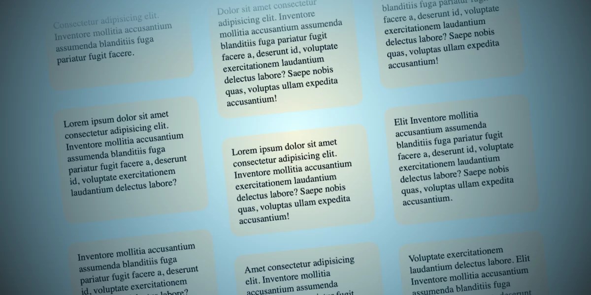
デザイナーの一見奇抜なアイデアが、意外と気に入ることはよくあります。私もこのコンセプトでまさにそうでした。ユーザーがページをスクロールしたときに、列内のアイテムが反対方向に移動するようなものを作る必要があったのです。
注: このデモは「動きを減らす」設定を尊重しているため、エフェクトを確認するにはモーションを有効にする必要があります。また、執筆時点ではChromeとSafariのサポートを確認しています。
意外と簡単です。現代のCSS機能、特にscroll-driven animationsのおかげです。それだけでなく、作っていて楽しいものでもあります! 私がどのようにアプローチしたかをお見せします。皆さんがどのように違う方法でやるかも、ぜひ共有してください。
HTML
HTMLは、親要素(.opposing-columns)、その子要素(.opposing-column)、さらにその子要素(.opposing-item)で構成されます。
<div class="opposing-columns">
  <!-- Column 1 -->
  <div class="opposing-column">
    <div class="opposing-item">...</div>
    <div class="opposing-item">...</div>
    <div class="opposing-item">...</div>
  </div>
  <!-- Column 2 -->
  <div class="opposing-column">
    <div class="opposing-item">...</div>
    <div class="opposing-item">...</div>
    <div class="opposing-item">...</div>
  </div>
  <!-- Column 3 -->
  <div class="opposing-column">
    <div class="opposing-item">...</div>
    <div class="opposing-item">...</div>
    <div class="opposing-item">...</div>
  </div>
</div>
これがマークアップに必要なすべてです。あとはCSSがやってくれます!
親コンテナのスタイリング
まず、このエフェクトを大きな画面にのみ適用するように設定します。小さい画面ではこのようなエフェクトをサポートする意味がほとんどなく、十分なスペースが必要になるためです。
/* Just on larger screens */
@media screen and (width >= 50rem) {
  .opposing-columns {
    display: flex;
    gap: 2rem;
    max-inline-size: min(90dvi, 50rem);
    margin-inline: auto;
  }
}
“マスキング”エフェクトの設定
各.opposing-column内のアイテムが、スクロール時に親の境界を越えて消えていくような錯覚を生むために、親コンテナに対してさらにいくつかの設定を行います。外側の列のアイテムはスクロール時に上方向へ、中央の列のアイテムは下方向へ移動します。親の境界を横切る際に、フェードアウトするようにしたいと考えています。
そこで、いくつかの処理を行います。まず、ドキュメント全体に背景色の変数を設定します。
@media screen and (width >= 50rem) {
  :root {
    --opposing-bg: lightcyan;
    background-color: var(--opposing-bg);
  }

  .opposing-columns {
    /* same styles as before */
  }
}次に、同じ背景色を親要素の:beforeおよび:after擬似要素にも適用します。
@media screen and (width >= 50rem) {
  :root {
    --opposing-bg: lightcyan;
    background-color: var(--opposing-bg);
  }

  .opposing-columns {
    /* same styles as before */

    &:before,
    &:after {
      content: "";
      position: absolute;
      inset-inline: 0;
      block-size: calc(var(--opposing-mask) * 3);
      pointer-events: none;
      z-index: 1;
    }
  }
}擬似要素にスタッキングコンテキストを確立し、親要素およびその子孫よりも1レイヤー上に配置している点に注意してください。これは、各列のアイテムがコンテナに出入りする際にマスクするための重要なポイントです。アイテムは擬似マスクの下をスライドしていることになります。
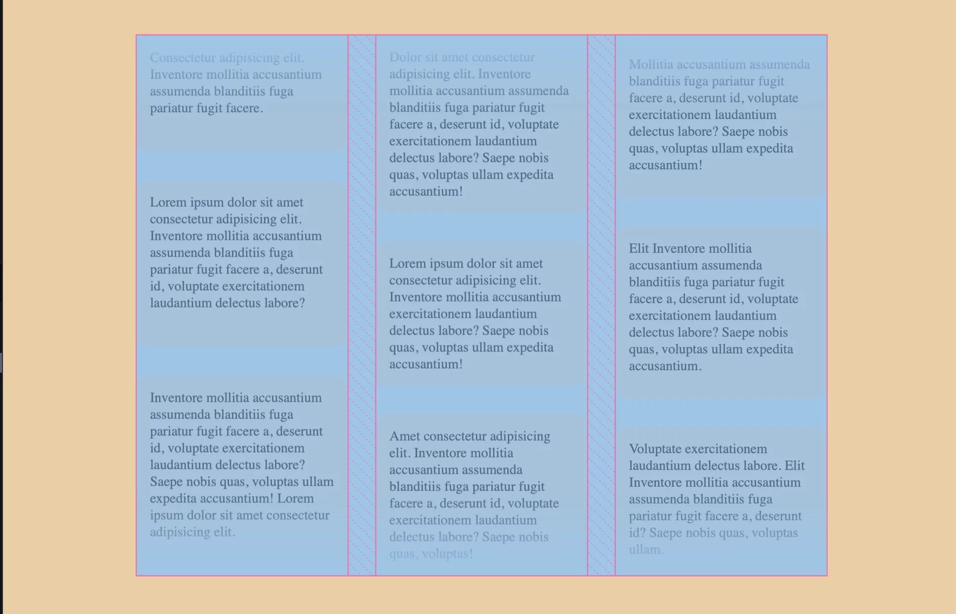
その上で、親要素と3つの列の間に垂直方向のスペースを追加する--opposing-maskという変数を作成しましょう。
@media screen and (width >= 50rem) {
  :root {
    --opposing-bg: lightcyan;
    --opposing-mask: 3rem;
    background-color: var(--opposing-bg);
  }

  .opposing-columns {
    display: flex;
    gap: 2rem;
    max-inline-size: min(90dvi, 50rem);
    margin-inline: auto;
    margin-block: var(--opposing-mask, 3rem);
    position: relative;
  }
}
親要素の擬似要素にも同じ処理を行い、block-sizeに--opposing-maskを3倍して適用します。これにより、擬似要素と親要素の間に追加の垂直スペースが生まれます。
@media screen and (width >= 50rem) {
  :root {
    --opposing-bg: lightcyan;
    --opposing-mask: 3rem;
    background-color: var(--opposing-bg);
  }

  .opposing-columns {
    /* same styles as before */

    &:before,
    &:after {
      content: "";
      position: absolute;
      inset-inline: 0;
      block-size: calc(var(--opposing-mask) * 3);
      pointer-events: none;
      z-index: 1;
    }
  }
}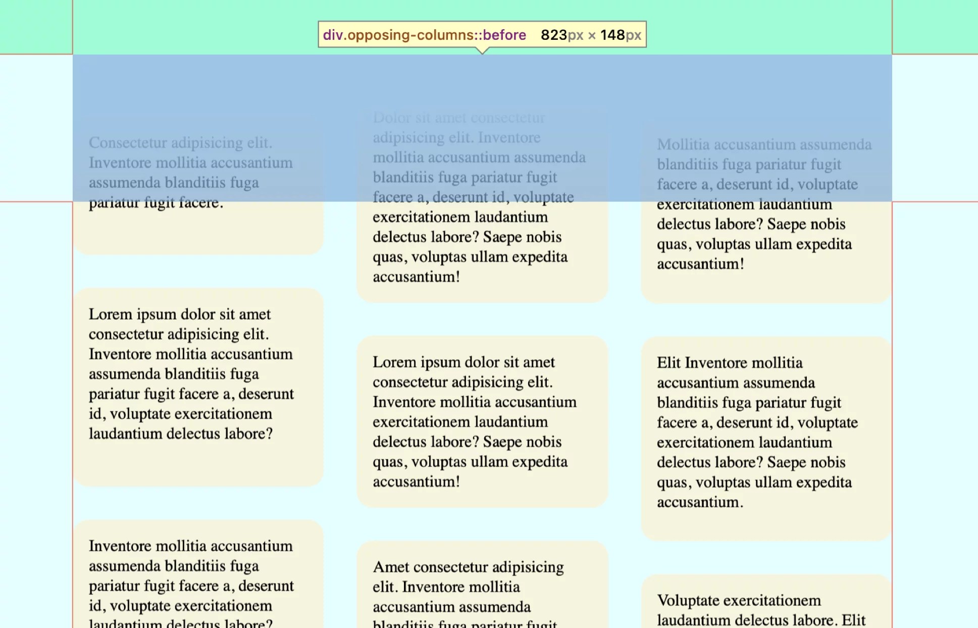
この先の展開が見えてきたかもしれません。親コンテナと擬似要素の間に十分なスペースができました。列のアイテムが親コンテナからスクロールして出ていく際にフェードアウトして見えるようにしたいと考えています。opacityなどを操作する必要はありません。擬似要素に背景グラデーションを追加するだけで実現できます。
:before擬似要素はコンテナの上部にあるため、ドキュメントの背景色に一致するソリッドカラーから透明へ、上から下へのグラデーションを設定します。一方、:after擬似要素は親コンテナの下部にあるため、グラデーションを反転させて透明からドキュメントの背景色へ、下から上へのグラデーションにします。
@media screen and (width >= 50rem) {
  :root {
    /* same styles as before */
  }

  .opposing-columns {
      /* same styles as before */

      &:before,
      &:after {
        /* same styles as before */
      }

      &:before {
        background-image: linear-gradient(
          to bottom,
          var(--opposing-bg) var(--opposing-mask),
          transparent
        );
        inset-block-start: calc(var(--opposing-mask) * -1);
      }

      &:after {
        background-image: linear-gradient(
          to top,
          var(--opposing-bg) var(--opposing-mask),
          transparent
        );
        inset-block-end: calc(var(--opposing-mask) * -1);
      }
    }
  }
}
列のレイアウト
魔法の部分に入る前に、各列内のアイテムのレイアウトを設定しておきましょう。各列は、フレックスコンテナである親の中にあるフレックスアイテムです。サイズを一定のポイントで制限しつつ(flex-basis: 10rem)、縮小(flex-shrink: 1)と拡大(flex-grow: 1)を許可します。
これらすべてをflexショートハンドプロパティで定義できます。
@media screen and (width >= 50rem) {
  /* same styles as before */

  .opposing-column {
    flex: 1 1 10rem;
  }
}ここで、各列をグリッドコンテナにしてgapプロパティでアイテム間にスペースを挿入できるようにします。
@media screen and (width >= 50rem) {
  /* same styles as before */

  .opposing-column {
    flex: 1 1 10rem;
    display: grid;
    gap: 2rem;
  }
}ここではFlexboxを使ってgapを利用することも可能ですが、デフォルトのレイアウトがrowになるため、columnに上書きする必要があります。この状況ではGridの方が簡潔です。
アニメーション!
ここが皆さんが待っていた部分ですね。列のアイテムがスクロール時に親コンテナに出入りできるように、すべてを設定してきました。次に必要なのは、そのスクロール動作を追加することです。
ここでanimation-timelineプロパティが非常に役立ちます。通常、CSSアニメーションは単独で実行されます。ページ読み込み時(または指定した遅延後)に開始し、設定した時間経過後に終了します。animation-timelineでは、アニメーションをスクロール位置に基づいて実行するよう指示します。これが「scroll-driven」アニメーションという用語の由来です。
ここでは2つのサポートされている関数、scroll()とview()が利用できます。関連していますが、scroll()は要素のスクロール位置に基づいてアニメーションを実行する点で大きく異なります。view()関数も似ていますが、要素がscrollport(つまり、要素が属するコンテナのスクロール可能な領域)に出入りする際の進行状況を追跡します。
ここではview()関数を使用します。親コンテナ内に明確なスクロール可能領域を設定しているためです。列のアイテム自体のスクロール位置ではなく、その領域に出入りする位置に基づいてアニメーションを実行する必要があります。
興味深い点は、view()に対して、アニメーションがスクロール可能領域に入った瞬間にどこで開始し、同じ領域から出た瞬間にどこで停止するかを正確に指定できることです。以下のように記述します。
/* Official syntax */
animation-timeline:  view([ <axis> || <'view-timeline-inset'>]?);
まず軸を定義してみましょう。
@media screen and (width >= 50rem) {
  /* same styles as before */

  .opposing-column {
    /* ... */
    animation-timeline: view();
    animation-range: entry cover;
  }
}これはまだ部分的にしか実現できていませんが、アニメーションを(1)scrollportに入った瞬間に開始(entry)し、(2)完全にその領域から出たときに終了(cover)するように指定しています。インセットを明示的に指定する必要があります。これにより、アニメーションの範囲が要素の出入り位置に対して相対的に確立されます。フルレンジが必要なので、entryは0%から始まり、アイテムがcoverされると100%で終了します。
@media screen and (width >= 50rem) {
  /* same styles as before */

  .opposing-column {
    /* ... */
    animation-timeline: view();
    animation-range: entry 0% cover 100%;
  }
}
最後に、アニメーションをリニアに実行するように設定します。スクロール時にアイテムが減速・加速する必要はありません。
@media screen and (width >= 50rem) {
  /* same styles as before */

  .opposing-column {
    /* ... */
    animation-timing-function: linear;
    animation-timeline: view();
    animation-range: entry 0% cover 100%;
  }
}
これで良さそうです。ただし、まだアニメーション自体は作成していません。実行時に何をさせたいかは設定しましたが、実際の動きを定義する必要があります。
3つの別々のCSSアニメーションを用意します。
- 1列目のアイテムを上方向に移動(translate)させるもの。
- 他の列のアイテム用に、1つ目のアニメーションを反転させたもの。
技術的には、外側の2つの列に1つ目のアニメーションを適用することも可能ですが、3つ目のアニメーションを少しオフセットさせて、列がずれて見えるようにしたいと考えています。
@keyframes scroll1 {
  from { transform: translateY(var(--opposing-mask)); }
  to { transform: translateY(calc(var(--opposing-mask) * -1)); }
}

@keyframes scroll2 {
  from { transform: translateY(calc(var(--opposing-mask) * -1)); }
  to { transform: translateY(var(--opposing-mask)); }
}

@keyframes scroll3 {
  from { transform: translateY(calc(var(--opposing-mask) * .66)); }
  to { transform: translateY(calc(var(--opposing-mask) * -.33)); }
}
これらを変数化しておけば、必要に応じて更新できます。
@media screen and (width >= 50rem) {
  :root {
    --opposing-bg: lightcyan;
    --opposing-mask: 3rem;
    --animation-1: scroll1;
    --animation-2: scroll2;
    --animation-3: scroll3;

    /* ... */
  }
}
…そして各列に適用します。
@media screen and (width >= 50rem) {
  /* same styles as before */

  .opposing-column {
    /* same styles as before */
  }

  :where(.opposing-column:nth-of-type(1)) {
    animation-name: var(--animation-1);
  }

  :where(.opposing-column:nth-of-type(2)) {
    animation-name: var(--animation-2);
  }

  :where(.opposing-column:nth-of-type(3)) {
    animation-name: var(--animation-3);
  }
}この際、ユーザーの「動きを減らす」設定を尊重するためにアニメーションを無効にし(マスクも削除しないと見た目がおかしくなる可能性があるため)、次のようにします。
@media (prefers-reduced-motion: reduce) {
  .opposing-column {
    animation: unset;

    &:before,
    &:after {
      content: unset;
    }
  }
}
まとめ
このように、scroll-driven animationsは本当に素晴らしい機能です。執筆時点ではまだFirefoxのサポートを待っている状況ですが、@supportsでラップして、サポートするブラウザではscroll-driven animationsを使用し、非対応ブラウザでは通常のアニメーションタイムラインにフォールバックするデフォルト体験を提供することも可能です。
@supports (animation-timeline: view()) {
  /* ... */
}
これはscroll-driven animationsができることのほんの一部に過ぎません。皆さんはどのようなものを作ったり実験したりしたことがありますか? または、この例に対してはどのようにアプローチしますか? ぜひ教えてください!
0 Comments
Log in to join the conversation.No comments yet. Be the first to share your thoughts.