
22 July 2026
Link copied to clipboard
Posted by Fahd Imtiaz, Senior Product Manager and Miguel Montemayor, Developer Relations Engineer, Android Developer Experience

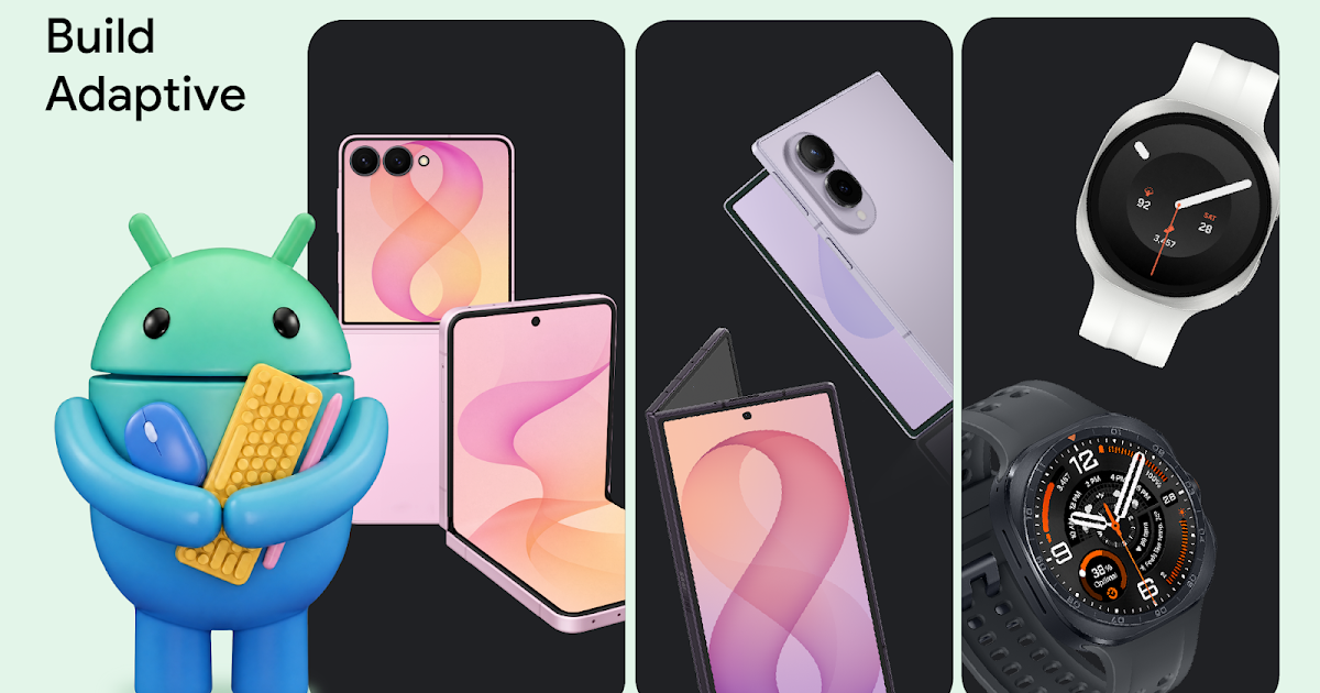
Today at Galaxy Unpacked, Samsung unveiled its latest lineup of foldable and wearable devices. For developers, this means that the variety of form factors, screen sizes, and device postures your app needs to support is expanding once again.
With devices like the Galaxy Z Fold8, the ecosystem is expanding to include hardware with a landscape-first natural orientation and a wider aspect ratio in its main display state. Whether a user is unfolding a large display, flipping open a cover screen, or glancing at their wrist, users expect a flawless experience. To help you meet this moment, we’re sharing actionable guidance and new tooling updates to enable you to build adaptively proactively.
Rethink layout architecture for dynamic displays, including ultra-wide foldables
Building for the latest foldables means dropping assumptions about display orientation and size. This is especially true for the Galaxy Z Fold8, which adopts an ultra-wide display, adding to the variety of aspect ratios to account for. Devices with this landscape-first natural orientation show the limitations of hardcoded layout rules when users unfold the device. That’s why we’ve introduced dedicated guidance for building for landscape foldables and trifolds.

To build a responsive UI that handles these physics seamlessly, focus on the following core pillars:
- Build fluid, adaptive layouts: Wide aspect ratios and compact vertical heights require fluid UIs that scale responsively. Our updated adaptive design guidance advises considering the window class width first to determine layout changes, then adjusting for height. To let individual components fluidly adapt to the grid, structure your layout using flexible containers that allow your content to automatically wrap, span, and reflow. For design inspiration browse our adaptive sample app and dual-screen design galleries.
- Track actual app space: Your app's display space rarely matches the physical device size, especially on an ultra-wide screen during multi-window, split-screen, or multitasking states. Sometimes even the orientations differ. Leverage Window Size Classes using the Jetpack Window Manager library to calculate the exact space your app occupies.
- Leverage the latest Jetpack Compose Update: Start by adopting the stable Jetpack Compose April '26 release (Compose BOM version
2026.04.01).Take advantage of the new structural layout tools to manage complex architectures. The new Grid API allows you to define dynamic tracks and column spans without the performance overhead of a lazy list. Pair Grid with the new FlexBox layout API to easily handle multi-axis alignment and dynamic item wrapping. You can also use the new MediaQuery API to adapt your UI to its environment, using conditions to detect signals like device posture, window size, and keyboard types. - Make your app fold aware: Use the Jetpack WindowManager library, which provides an API surface for foldable device window features such as folds and hinges. When your app is fold aware, it can adapt its layout to avoid placing important content in the area of folds or hinges and use folds and hinges as natural separators.
- Maintain app continuity: Avoid breaking the user journey when the device configuration shifts. Retain your UI state using ViewModel to ensure smooth transitions when a user folds or unfolds their device.

Ensure seamless camera capture on foldable devices
Camera implementation on foldables brings unique hardware quirks. Moving from a compact outer display to an expanded inner display introduces distinct layout aspect ratios while device rotation remains unchanged. If an app assumes a fixed portrait relationship between the camera sensor and the device layout, the app will likely suffer from sideways, stretched, or cropped previews during these folding transitions.
When optimizing your app's media pipeline, migrate your capture experiences to CameraX using the CameraX migration skill. The library’s PreviewView automatically handles sensor orientation, device rotation, and scaling behind the scenes. This guarantees a clean, stable preview regardless of how the user holds or positions the device. If you are maintaining an existing Camera2 codebase, integrate the CameraViewfinder library to apply these complex aspect ratio and rotation transformations automatically without needing a total architecture overhaul.
Extend glanceable interactions to Wear OS 7
The opportunity to build for this new generation of devices extends right to the wrist. Launching with Wear OS 7, Wear Widgets give you a fresh surface to provide users with instant, glanceable access to their essential updates. You can build these highly expressive experiences using Jetpack Glance and RemoteCompose. Crucially, Widgets built with this framework can now populate multi-widget tiles that were previously reserved for first-party widgets.
Build intelligent features
Gemini intelligence already completes tasks on users’ behalf, and you can experiment with the intelligence system by sharing your apps capabilities.
Samsung’s new foldable devices come with Gemini Nano 4, our latest on-device model. Nano 4 provides support for over 140 languages, better multimodal understanding, and much more. Use ML Kit’s Prompt API with advanced features like structured output and thinking mode to build intelligent features on-device.
Start optimizing today
The tools and frameworks are ready to help you optimize your app for all screen sizes. Begin by exploring our guidance for building adaptive apps to learn more about core adaptive design principles.
To dive deeper, check out our comprehensive YouTube playlist. Finally, ensure your app delivers a flawless, premium experience on the newest form factors by reviewing our dedicated quality guidelines for trifolds and landscape foldables and WearOS.
Unfold the future today!
0 Comments
Log in to join the conversation.No comments yet. Be the first to share your thoughts.