
The notch on a MacBook is strange real estate.
It is always there. It sits at the top of the screen, close to the menu bar, close to system controls, close to whatever you are doing. But most of the time it is treated like a cutout to design around instead of a place software can use.
That felt like a missed opportunity.
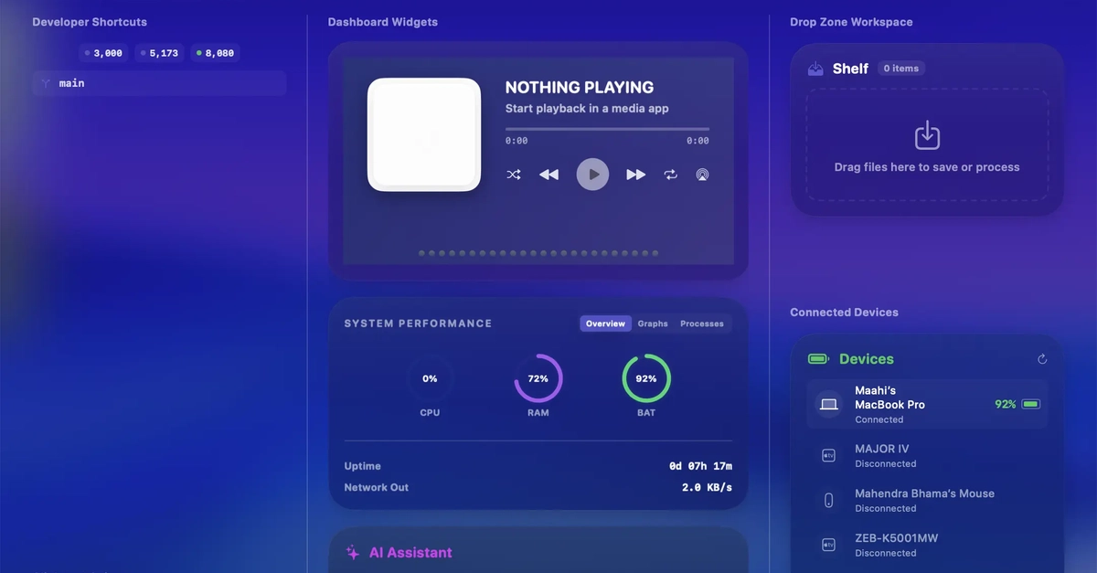
So I built SwiftNotch, a macOS menu bar app that turns the notch area into an expandable productivity dashboard. Hover near the notch or press Option + Space, and the quiet black shape becomes a small command center for widgets, files, media, shortcuts, developer tools, and window actions.
Website: swiftnotch.xyz
Demo video:
Launch note: SwiftNotch 1.x is free during beta. I want early Mac users to try the full experience, share feedback, and help shape the app before SwiftNotch 2.0 introduces paid plans.
The idea
I did not want to build another large dashboard that asks you to leave your current app.
The goal was the opposite: make useful tools available in the smallest possible space, without breaking flow.
The notch is perfect for this because it already behaves like a visual anchor. You know where it is without thinking. If it can expand only when needed, it becomes a temporary interface layer instead of another permanent panel.
SwiftNotch starts collapsed. When activated, it opens into a compact dashboard with the widgets and actions you choose.
What SwiftNotch does
The current app includes 31 built-in widgets across productivity, system utilities, media, automation, and developer workflows.
Some examples:
- Media Control for Spotify, Apple Music, VLC, YouTube, and browser players
- Shelf for drag-and-drop file staging, quick sharing, paths, iCloud actions, and zip workflows
- Clipboard History for snippets, links, and quick paste
- Calendar Events, Reminders, Notes, Weather, World Clock, and Pomodoro
- Quick Toggles for Wi-Fi, Bluetooth, Dark Mode, and volume
- Window Snapping with layouts for halves, thirds, quarters, and custom grids
- Developer Hub for CPU, memory, disk, ports, and workspace signals
- AI Coding HUD for local CLI assistants like Claude Code
- GitHub / code hosting views for repository and pipeline signals
The app is not trying to replace full-size tools. It is designed for the tiny interactions that usually interrupt you: checking a meeting, controlling music, grabbing a copied command, staging a file, snapping a window, or quickly asking an AI coding assistant something.
The feature I care about most: drop actions
One of my favorite parts is the Shelf.
You can drag files, links, or text toward the notch and SwiftNotch turns that gesture into context-aware actions. Instead of opening Finder, Shortcuts, AirDrop, or another utility, you can stage the item and act on it from the same surface.
For example:
- Drop a file and copy its absolute path
- Stage multiple files in a carousel
- Prepare quick sharing actions
- Zip or convert media
- Send something toward iCloud or AirDrop
This made the notch feel less like a widget drawer and more like a spatial command target.
Why I built it natively
SwiftNotch is built as a native macOS app using SwiftUI and AppKit.
That mattered because a notch utility has to feel lightweight. It sits close to system UI, so performance and polish are not optional. The expanded view should appear quickly, animate naturally, and use almost no CPU when idle.
The web dashboard for the product is built separately with React, Vite, Framer Motion, i18next, and custom CSS, but the macOS app itself is native.
The site now includes account flows too: email signup, login, verification, password recovery, OAuth entry points, downloads, and billing/account surfaces. One small deployment lesson from that work: production auth requests are routed through same-origin /api rewrites before reaching the backend, which keeps the browser out of cross-origin preflight trouble and makes local/prod debugging much less fragile.
The product site also helped shape the app. Building a visual showcase forced me to explain each feature clearly, which made it obvious which widgets felt essential and which ones were just noise.
Designing for the notch is different
The hardest design constraint is that the notch is small.
You cannot just shrink a regular dashboard and expect it to work. The interface has to be glanceable, modular, and forgiving. Every widget needs a focused job.
I ended up thinking about SwiftNotch in three states:
- Collapsed: invisible until needed
- Expanded: quick controls, widgets, and previews
- Focused: deeper actions like settings, integrations, profiles, and account options
That helped keep the app from becoming a giant floating window with a notch theme.
Who it is for
SwiftNotch is for Mac users who like small workflow improvements that compound during the day.
It is especially useful if you:
- Use a notched MacBook
- Switch between music, meetings, notes, and files constantly
- Want window snapping without a heavy window manager
- Work with terminals, local developer tools, or AI coding assistants
- Prefer compact utilities over big dashboards
It also supports modern macOS versions, including Sonoma and Sequoia, and includes dark/light appearance options.
Free throughout the 1.x beta
For launch, I am keeping SwiftNotch 1.x completely free during beta.
That means early users can try the core dashboard, widgets, Shelf actions, media controls, developer tools, and window snapping without paying first. SwiftNotch 2.0 and later will be paid, but the plan for 1.x is simple: get the app into real workflows, listen carefully, and use that feedback to decide what SwiftNotch should become next.
I care more about learning from actual Mac users right now than rushing into pricing too early.
What is next
SwiftNotch 1.0 is focused on the core dashboard experience: onboarding, settings, profiles, widget configuration, Shelf actions, and window snapping.
The next areas I am exploring are:
- More developer-focused widgets
- Better automation profiles
- More integrations
- A larger widget marketplace
- Improvements to multi-display behavior
The bigger question is still the same one that started the project:
What should live in the tiny part of the screen that is always visible, but almost never useful?
SwiftNotch is my answer.
You can check it out here: https://swiftnotch.xyz
I would love feedback from other macOS users and builders. What would you put in the notch?
0 Comments
Log in to join the conversation.No comments yet. Be the first to share your thoughts.