
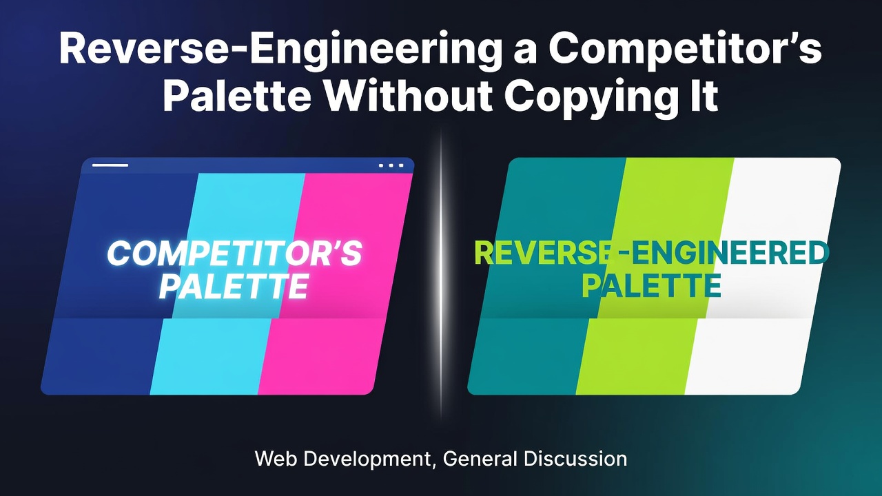
Every team eventually opens a competitor's website, takes one look at the colors, and asks the wrong question: "Can we get the exact hex values?" The better question — the one that actually moves product work forward — is "What constraints produced that palette, and which of those constraints do we want to inherit?" A palette is the surface; the system behind it is the asset. This article walks through how to read a competitor's color system, decide which pieces are worth borrowing, and ship a new one that holds up under accessibility review, brand review, and the inevitable "make it pop" meeting.
What You're Actually Looking At When You Look At a Palette
A website usually exposes two to seven "brand" colors and a much larger set of neutrals, surface tints, and semantic tokens (success, warning, danger, focus). The brand hexes are the easy part. The interesting work is in the gradients, the subtle border tones, and the way the neutral text scales from 12px to 32px without changing contrast. Those details encode decisions about contrast targets, theme count, and how the design system treats elevation.
The most useful first move is to sample more than the hero. Pull the body text color, the muted secondary text, the disabled control color, the focus ring, the link color, and the surface beneath a modal. Five to eight swatches across these surfaces will tell you more about the system's intent than any single logo.
When you want to automate that sampling, an image-driven extractor is faster than eyeballing DevTools across three competitor sites. A free color palette generator can take a screenshot or a hero image and hand you a candidate cluster in seconds. Treat the output as a starting set, not an answer.
Constraints First, Colors Second
Before you pick a hex, write down the constraints your palette must satisfy. Skipping this step is how teams end up redoing the whole system four months later.
A workable checklist for a typical SaaS surface looks like:
- WCAG 2.2 AA contrast (4.5:1 for body text, 3:1 for large text and UI components).
- A single neutral ramp that holds contrast at steps 50, 100, 300, 500, 700, 900.
- One accent color that survives both a light and a dark theme without resaturation.
- Semantic tokens (
success,warning,danger,info) that are distinguishable for the common forms of color blindness. - A focus ring color visible on every interactive surface, including the disabled-tinted ones.
WCAG itself is the authoritative reference here, and the Web Content Accessibility Guidelines (WCAG) 2.2 working draft is stable enough to cite directly. For the color-blindness constraint, the EnChroma color vision deficiency overview on Wikipedia is a good primer, but the practical test is to convert your semantic set to grayscale and confirm the four roles still read as different lightnesses — that's the only check that doesn't depend on the viewer's monitor.
Three Patterns You See Over and Over
After auditing a few dozen production sites, the palette shapes collapse into three patterns. Naming them helps you decide which one to copy.
Pattern A — Bold accent, neutral everything else. One saturated brand color, a near-black text color, a near-white surface, and a five-stop gray ramp. This is the Stripe / Linear shape. It ages well, themes cheaply, and rarely needs a redesign because the accent does the talking. If your product is information-dense, this is usually the safest choice.
Pattern B — Tonal brand ramp. The brand color appears at three to five lightnesses, used as backgrounds, borders, and tinted surfaces. Notion and many fintech apps live here. It looks polished, but it punishes you later: every new surface has to be classified as "which step of the ramp?" and your designers will argue about it. Borrow this pattern only if you have a design system owner who will police the ramp.
Pattern C — Duotone or gradient-driven. Two colors that meet in a gradient, used heavily in hero areas and empty states. Looks distinctive, photographs well in case studies, and tends to age out within two years because gradients read as a specific era. Useful as an accent to Patterns A or B; risky as the spine of the system.
Most "original" palettes are a hybrid: A for the product, C for marketing. Decide which is which before you start sampling.
The QA Loop That Catches What Sampling Won't
Sampling gets you candidates. A small QA loop is what turns candidates into a palette you can merge.
Run this loop once per candidate set:
- Convert every token to its perceptual lightness using the CIELAB L* value, not the RGB average. Two colors with the same hex-averaged brightness can have L* values a full 10 points apart, which is why "this gray looks heavier than that gray" is a real complaint. The math is defined in the CIE 1976 L*a*b* specification on Wikipedia and is straightforward to compute or look up in a color library.
- Check contrast at the actual rendered sizes. A 4.5:1 ratio at 16px does not guarantee 4.5:1 at 14px on a low-DPI laptop screen. The WCAG contrast guidance is a minimum, not a target.
- Render the candidate set under three color profiles: sRGB (the default web assumption), Display P3 (modern Macs), and a grayscale conversion. If a token disappears in grayscale, it is carrying information by hue alone, which means roughly one in twelve male users will lose that signal.
- Theme swap. Take your light-theme tokens, invert the lightness while preserving hue, and re-run steps 2 and 3. Tokens that collapse to the same L* in dark mode need a manual adjustment.
- Screenshot test. Drop the palette into a real screen — a settings page, a data table, an error state. If anything looks muddy, the cause is almost always a neutral step that sits too close to its neighbors.
Two passes through this loop is normal. Three is a sign that the base neutral ramp is wrong and you should restart it rather than patch it.
Deciding What to Borrow vs. Invent
Once you have candidates and a QA-passing baseline, the hardest decision is which competitor constraints to copy. My default rule of thumb:
- Borrow the contrast targets. They are a public-health floor, not a stylistic choice.
- Borrow the neutral ramp shape if the competitor has a design system team. If they don't, the ramp is probably accidental and you'll invent a better one by accident too.
- Invent the accent. An accent that you can defend in a brand review — "this is what we want to be associated with" — is worth more than a slightly more fashionable hue.
- Invent the semantic palette entirely. Success/warning/danger/info is a UX convention, and copying it from a competitor signals that you are a substitute, not an alternative.
This is also the point where legal risk is low but perception risk is real. Hex values themselves are not copyrightable, but a palette used in a way that confuses customers can attract trademark complaints in some jurisdictions. The safer move is to share the shape of the system and diverge on the specific hex values, especially for the accent and any logo-adjacent color.
Shipping and Versioning the Result
A palette you can't version is a palette you'll redo. Treat the hex set as code: store it in a single tokens file, generate the CSS variables and the Tailwind config from it, and add a contrast-check script to CI so a careless edit fails the build.
A minimal pipeline:
- Tokens source: one JSON or YAML file per theme.
- Build step: emits CSS custom properties and a JS object.
- Tests: assert WCAG ratios for every text-on-surface pair; assert that semantic tokens remain distinguishable in grayscale; assert that light and dark themes share a single hue family per role.
- Changelog: every palette change gets a one-line entry. Future you, reading "tightened neutral 300 for AAA on body text," will be grateful.
The reason to put this discipline in place before launch, not after, is that palette churn is one of the top causes of design-debt sprints. Two weeks of token plumbing now saves a quarter of arguing later.
Frequently asked questions
How many colors should a SaaS palette actually have?
For the design system itself, plan for around 30 to 50 tokens: a 6–8 step neutral ramp, 1–2 accents at 3 lightnesses each, 4 semantic colors at 2 lightnesses each, and a handful of surface/border tokens. Anything beyond that usually means two features have invented their own palettes and need to be reconciled, not added to.
Is it ever okay to copy a competitor's exact hex values?
For neutrals and accessibility-driven choices, yes — there is often one defensible answer and reinventing it wastes effort. For the brand accent and any logo-adjacent color, no. The legal risk is small, but the brand risk is large: customers will notice, and the comparison will flatter the larger company.
What's the fastest way to tell a palette will fail in production?
Render it grayscale. If semantic roles (success, warning, danger, info) collapse to the same lightness, the palette is carrying meaning by hue alone and will fail for color-blind users and on poor displays. Fix that before worrying about anything else.
How often should a palette be revisited?
Plan for a small review every quarter and a full audit every two years. The triggers that should force an out-of-cycle review are: a rebrand, a new product line that needs its own accent, a switch to a new default theme (light → dark or vice versa), or any WCAG version bump that tightens contrast requirements.
This article was drafted with AI assistance and reviewed for technical accuracy before publishing.
0 Comments
Log in to join the conversation.No comments yet. Be the first to share your thoughts.