

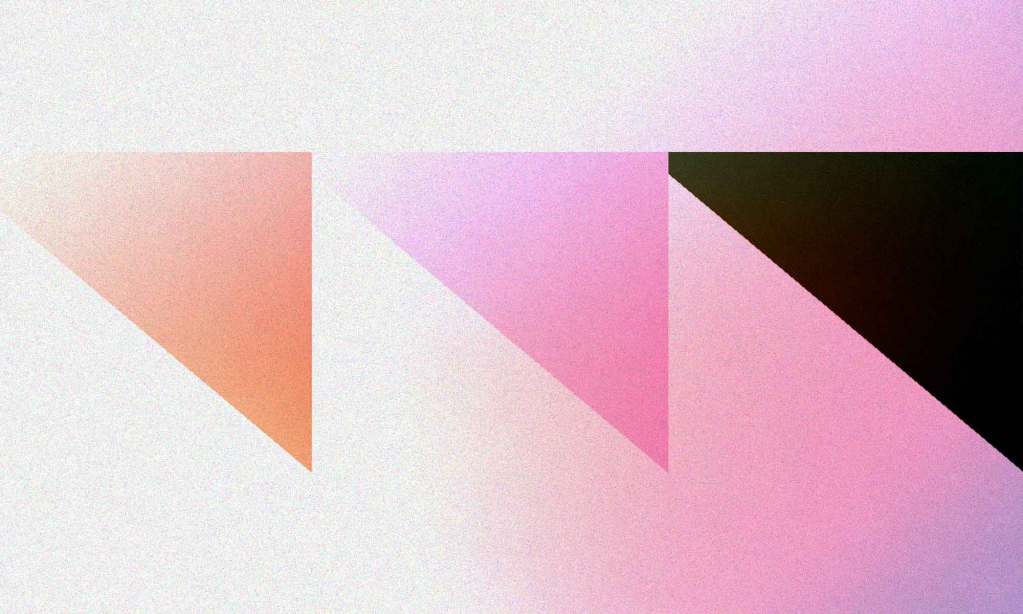
It took me a while to get it, but conic-gradient() in CSS is actually pretty useful. For a while I was like, how many times do you actually need a this color-picker ass look?
Not very often.
There is a clearer use case when you set hard stops for the colors.
Pie charts are cool, but honestly, you’re probably better off with <svg> so you have individual elements for interactivity and accessibility information and such. Backgrounds in CSS are generally decoration-only.
My brain changed a little when I thought about how you can move where the center of the conic gradient is, though. Here I’ll put the origin at the bottom left corner (but a little further away from it, just for fun, and I can burst out some rays!
I also like how an actual gradient looks across a button.
I was thinking about this when I saw this screenshot of Studio Heyday on Siteinspire.
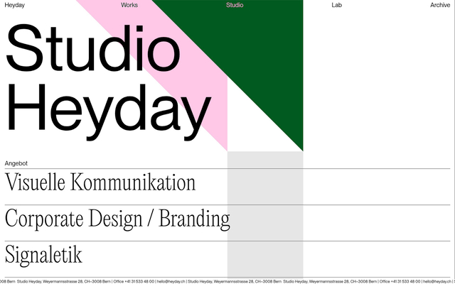
What are those big beautiful triangles but conic gradients with hard stops at that angle?
We can set up a syntax where we “start” at the top-left corner point horizontally. By “point horizontally” I mean instead of the great wand of conic gradient painting starting like a clock hand poinging at 12 noon, we start pointing at 3 o’clock.
background: conic-gradient(
  /* start in the upper left pointing at 3 o'clock */
  from 0.25turn at 0 0,
  green 0 45deg,
  white 45deg
);Code language: CSS (css)
Then we set our color stops in degrees, which is sometimes easier to think about when dealing in circular stuff.
But Chris! (you say). I don’t need a conic-gradient() for this, this is simple an angled linear-gradient()! You’re correct of course. That’s easy enough to do as well. But I quite like how we’re dealing with angles here, as since we’re specifically thinking about triangles, we can think in degrees. And if we’re confined into a box and the color angle is < 45deg, that’s just a lot of triangular control I’d say.
When I set out to build something like the Studio Hey nav triangles, this is the approach I took. I figured if I had triangular control like this, I could also alter the angles on hover, and I used a little linear() easing to make them jiggle a bit.
There are Many Other Ways To Make Triangles
- There’s the classic technique using just one of four borders on a zero-dimensions box.
- You can clip one out with
clip-path: polygon(); - You could use the brand new
border-shape. - You could draw one in SVG with
<polygon> - You could draw on on an
<canvas>with.lineTo()and such - You could use some kind of skew transform and get a triangular side and then hide the overflow or something.
Honestly there is probably a dozen more ways if you sat down and figured them all out!
Want to expand your CSS skills?

Our full CSS learning path covers everything from fundamentals to advanced layouts & design systems.
- Personalized Learning
- Industry-Leading Experts
- 24 Learning Paths
- Live Interactive Workshops
20% Off
0 Comments
Log in to join the conversation.No comments yet. Be the first to share your thoughts.