
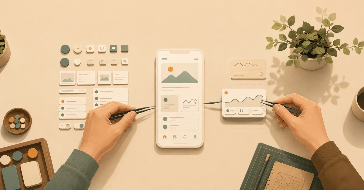
In GoodBarber, you build an app without writing code: you assemble components, drag and drop, with a design system holding everything coherent underneath. Recently, a second way in appeared: you can get a custom section by describing it to an AI in plain language. Two ways of creating now live in the same back office — and the question comes immediately: is this the beginning of the end for drag & drop?
No. And that "no" isn't a defensive reflex — it's an interface-architecture choice you can reason about.
The ladder everyone knows
The history of creation tools gets told the same way by everyone, and it's true: a ladder of abstraction. First, code — total control, total complexity. Then direct manipulation — drag & drop: you touch the rendering itself, the first great democratization. Then components — you stop aligning pixels and start assembling coherent elements, governed by a design system. And now the prompt — you describe, the machine produces. Each rung up, you move away from the mechanics and closer to the intent.
None of that is a revelation. What gets told less often is the conclusion you reach when you actually operate a product sitting on that ladder: every time a new rung appeared, the prediction was the same — this one makes the others obsolete. It never came true. The prompt won't be the exception, and here's why.
What drag & drop does better — and always will
For anything that can be shown, direct manipulation is unbeatable. This button, two pixels lower; this image, at the top of the section; this menu, in this order: the gesture is the description — the sentence explaining it to an AI is longer than the action itself. And a visual interface does something besides taking orders: it shows you what's possible. A settings panel is a map of what the product can do; an empty prompt field is an invitation to guess.
That's why the no-code core of the platform — component management, screens, navigation, design — stays drag & drop, deliberately. It isn't the old interface we haven't migrated yet; it's the right interface for that category of intent: visible, precise, showable.
What the prompt allows — that a visual interface never could
That leaves the long tail: the specific, singular needs no catalog covers. Serve each of them through drag & drop and every one carries an interface cost — one more panel, more options, more special cases. And that cost is paid by everyone: every option added for one customer weighs down the screen for all the others. Push that logic to the end and you know where it lands: the editor that tries to allow everything becomes so dense it requires the training it promised to spare you. Drawing the unpredictable only comes at the price of an oversized UI.
The prompt inverts that relationship, and that's its real justification. Its surface is constant — a text field — no matter how complex the request. "A loan simulator: three fields, the monthly payment computing itself, a button to get a callback": no reasonable settings panel offers that; a sentence does. The prompt isn't the new interface for everything — it's the interface for what couldn't reasonably be drawn. The two aren't competing: they don't play on the same field. Drag & drop routes the intentions you can show; the prompt routes the ones you couldn't.
The engineering is in the seams
If the two interfaces coexist, the engineering work moves. It isn't in the generation itself — it's in the seams: what makes the prompt's output land in the same world as everything else, instead of floating alongside it.
The first seam is the design system. What the AI produces must not leave the rails the design system guarantees everywhere else — otherwise every generated section is a graft, and the app loses the coherence that held it together. We took that habit early, on a modest case: our AI palette generator doesn't output "some colors," it outputs a palette that enters the design system's four-color semantic system, where it inherits the contrast rules already in force. The AI rung rests on the rung below — which is what makes its output usable without inspection.
The second seam is at the very bottom of the ladder: whichever interface you came through, everything ends in the same place — a real app, submitted to the stores, that will still have to work three years from now. Abstraction hides that complexity; it doesn't eliminate it — someone carries it, underneath, continuously. That's a subject of its own; just hold on to this: no rung, not even the prompt, has made it disappear.
The next rung, not the last
The prompt probably isn't the top of the ladder. What comes next, and when, we don't know; the pattern, though, is stable: each new rung doesn't saw off the ones below — it rests on them, and gives each a sharper role than before.
Hence a simple test when you evaluate an "AI-powered" creation tool: count the paths. Does it force its one rung on you — describing everything, even what a gesture could show? Or does every intent keep its shortest path — the gesture for the precise, the system for the coherent, the sentence for the unpredictable? A creation tool isn't judged by the height of its newest rung, but by how freely you can move between them.
Climbing one rung higher has never meant sawing off the others.
0 Comments
Log in to join the conversation.No comments yet. Be the first to share your thoughts.