
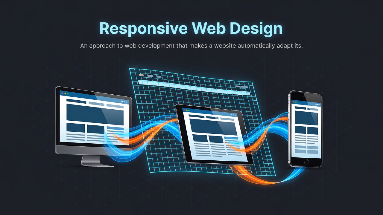

Responsive Web Design is an approach to web development that makes a website automatically adapt its layout, images, and content to fit the screen size and orientation of whatever device is viewing it whether it's a desktop monitor, a tablet, or a smartphone screen.
Instead of building separate websites for desktop users (example.com) and mobile users (m.example.com), developers build one single code base that fluidly resizes.
The Three Core Technical Pillars:
Fluid Grids
- Traditional web pages used fixed widths. Responsive design uses relative units like percentages, viewport units, or CSS Grid/Flexbox. Elements shrink or expand proportionally as the viewport scales.
Flexible Images & Media
- Media is set to never exceed its container size using CSS rules like max-width: 100%. This prevents large images from overflowing small mobile viewports or breaking the layout.
CSS Media Queries
- Media queries allow developers to apply specific CSS rules only when certain conditions are met—most commonly screen width breakpoints.
Why Responsive Design Matters
- Better User Experience: Users don't have to pinch, zoom, or scroll horizontally to read content.
- Cost Efficiency: Maintaining a single responsive codebase is significantly faster and cheaper than managing separate desktop and mobile versions.
0 Comments
Log in to join the conversation.No comments yet. Be the first to share your thoughts.